
When doing any type of photography, whether it is birds, wildlife, close-ups, or landscapes, it’s good to have someone who inspires you to want to be creative yourself. Of course you won’t be able to copy an image composition 100%, because each photographer’s thought process and technique for working with both light and composition is going to be a bit different from yours. Still, you can observe how they composed an image, what techniques they used and how they utilized light.
Who better to try and base your landscape photos on than the master, Ansel Adams? It was his work that got me interested in outdoor photography, and it took numerous years of study to grasp and fully understand what makes his images so unique. Today, when doing landscape photography, I try to let the inspiration of his work play into what I’m trying to accomplish.
A major component of his style of work is based on flow – how he blends the foreground and background so they are in harmony. There are times he put two complimentary subjects together that could have stood alone, and other times the foreground of a photo has a seamless flow into the background. Both styles help the viewer’s eye to move from the foreground into the background.
As the photographer, you need to keep the sense of flow in mind when composing your landscape images. It doesn’t just happen. You’ll need to put some thought into the process.
One quote from Adams puts it into perspective: “Landscape photography is the supreme test of the photographer – and often the supreme disappointment.” There will be many times when you’ll be disappointed, but when it’s done right and everything comes out the way you envisioned it, it’s very rewarding.
Let’s look at a few ways to create flow within a photograph.
Lines
Layers
Foreground and background harmony – complimenting the subject
LINES
The line(s) that move the eye around the frame can be subtle and implied or quite prominent. Both will lead the viewer through the scene. They can be man-made or part of the natural environment. They can be straight or curved. It can take some moving around to compose the photo so those lines make a smooth transition into the background, so take the time needed to accomplish that goal.
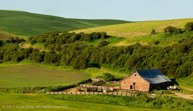
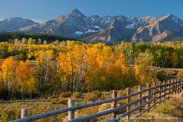
Fences or tree lines make for very easy lines to take the viewer back into the image, as do flowing rivers and meandering shorelines.
A lot of times the viewer might not know what you did to make an image more appealing, unless it’s another photographer; they just know that there’s something about the photo that captivates their interest. How you compose the scene to pull them to the point of interest or move smoothly throughout is what separates an ordinary photo from a really nice one.
Using the techniques learned and ideas from images you like will help drive you to create better images each time out.
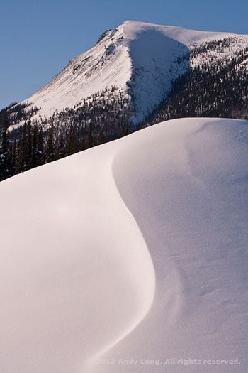
Be sure to take the time to move left or right and see if you can merge foregrounds with backgrounds. Here, I moved to the left and created a simple flow of the S curve in the snow and merged it with the lines in the mountain.
One thought to keep in mind when using line to lead the viewer back into the image is to not have it coming directly out of the corner of the frame. Having it offset a little bit creates just enough tension to not make it seem contrived. That little bit of space between the corner and the line offers an easier starting point than directly out of the corner.
It’s too easy to put it right in the corner, so take the time to see if it’s better coming out above or to the side. Go ahead and make the image both ways, so you can make the final decision later – when you see it on the computer. You can then decide which has the best feel.
LAYERS
There are more scenes out there with layers to help move the eye from front to back than you can imagine. Again, some are quite obvious and you can’t help but see the layers in the photo. They can be layers of colors, lines, textures, or conditions.
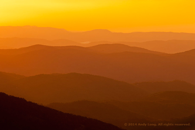
The foggy morning scene above fully speaks of layers due to the hazy conditions. You can easily see each layer stepping back through the image frame by the different tonal values, along with all of the layered lines. The only thing I had to concern myself with in the composition was finding an anchor point from which the viewer could first connect.
While a photo of just the misty mountains could have worked, I liked having the darkness of the closest ridge to create a starting point. It helps with the subsequent gradations of the tones the further back into the image the eye goes.
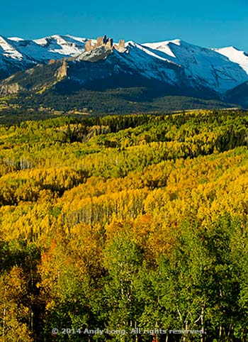
Layers can also be made from the same subject, such as trees, as long as there is something that separates different sections. These aspens have a variety of color groupings to them, starting with the greens up front, followed by yellow and lime. The pines provide a transition leading up to the mountains and into the crisp blue sky that appeared after sunrise.
Where does your eye go first in the photo? The eye will go to the area of most contrast first. Even if that starts in the back of the of the image frame, the viewer will move forward and then move back again from the foreground to background based on the flow, especially one that has somewhat of a stepladder effect.
The different colors from front to back form a step-ladder taking they eye to the mountain ridge at the top of the composition.
Keep in mind… The eye is going to tend to go where there is major contrast between two subjects. You hear that a bright spot in a photo will pull the eye away from the main subject and is a distraction, but really that bright spot usually contrasts highly with something next to it. Keep the contrast idea in mind with regards to colors as well. Let the colors and the tones work nicely together. There is a natural progression in values and not a lot of stark changes back and forth.
Harmony
Looking through the viewfinder, think about what all is included and how the different elements work together to make an appealing. With landscapes, there is plenty of time to make it right – they are not going to move. If the light isn’t quite right when you arrive on location, work on the compositional elements first and then wait for the right light to showcase the scene – both the direction of light as well as the quality of light.
Your goal is to pick your subject and then create an image where all the surrounding elements compliment that subject with a harmonious flow from the foreground to the background.
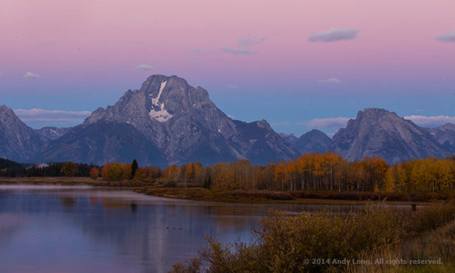
The Teton scene is two-fold; harmony and the variations in textural layers. The smooth silky water flows into trees, which then leads to what you know to be the hard, rough texture of the mountains. Finally, the pink colored sky just before sunrise softens the scene. The contrasting colors between each layer along with the different textures help walk the viewer back through the composition.
With Mount Moran being the main focal point in the composition, it’s easy for the eye to go directly to it. Everything else in the image supports it and does not distract – pull the eye away from the subject.
While Ansel Adams didn’t make as many photos as we do today with our digital medium, I imagine he threw away his fair share of negatives. What I do know is that it is obvious that he took the necessary time needed to compose his final images correctly in-camera.
He, along with many others, is an inspiration. Study their portfolios, find what made the image work and then head out into the field and work on creating landscape photos with great lines, layers and harmony.
by Andy Long
First Light Photo Workshops
All text & photos: © 2015 Andy Long. All rights reserved.
Leave a Reply