
© 2014 Margo Taussig Pinkerton. All right reserved.
This image has been prepared for the web and was a 48.4KB file before I added the Digimarc. Processed at 100% quality, it grows to 100KB.
…or What settings should I use? …
Realizing that there is a lot of misinformation and confusion out there regarding the output of your photographs, I would like to present an overview with some guidelines, no more – this is not a one-size-fits-all process. There is plenty of in-depth information on various Internet websites.
Let’s start with the Web and e-Mail. You will need to make sure you have a proper copyright notice on all your images. I am continually amazed at even long-time professional photographers who do not have a legal copyright notice. For more information on the topic, please read our article © Is for Copyright. In this day of what’s mine is mine, and by the way, what’s yours is mine, too, many of us do not want to make it easy for people to steal our images. Personally, the idea of someone else making money off a photograph I have made is offensive and to me, unethical.
One way to help combat this is to lower the quality of images posted on the web and to add a watermark to let people know you own all rights to your respective photographs. Can someone remove the watermark? Yes, but does it put people on notice that the photographs are yours? Yes again. Further, it slows them down a bit.
For sharing images by e-mail, it is not a kindness to clog someone’s inbox with a humongous file. Unless you know they are going to print out your image, treat it as a web-based one.
For print, I do not watermark my images at all. Instead, I sign the prints in the white space just below the image and again on the mat above. That way, if my print is ever reframed/rematted by an owner, our information remains with the image.
From there?
PIXELS
The web can only register a limited 72 pixels per inch (ppi). That means, there are only 5,184 pixels in each square inch. Sound like a lot? Not really, when you figure that printing out a 4″ x 6″ photo at a modest 240 ppi (pixels per inch) affords over ten times that amount.
I have read in several places that you do not want the output quality for the web to go over 76. Many people set the quality of their images at 70. I compromise at 75.
If I were to print it out as a 16″ x 24″ image, I would select 360ppi at 100% quality. Some printing services only offer 300ppi, and that probably works for most situations.
For a 4″ x 6″ or 8″ x 12″, 240ppi suffices quite well.
Dave Robertson, who has taught color management and printing, provided some additional input, so you may want to get on the web and research this further.
Mr. Robertson states, “Every printer has a native resolution. It is a better practice to change the resolution of the image in a program like Photoshop rather than the printer driver because the algorithm used by Photoshop does a better job.”
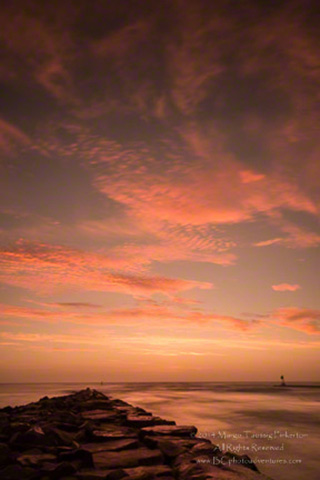
© 2014 Margo Taussig Pinkerton. All right reserved.
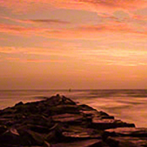
To show why pixels are so important, I took the image above, grabbed it off the Internet, changed it to a 4″ x 6″ image for printing at 240ppi. See how the image degraded beyond the pale? Yippeee!
COLOR SPACE
Without going into a whole technical treatise, there are three color spaces that most photographers use: sRGB (that I choose to call screen RGB), Adobe RGB 1998, and ProPhoto RGB. sRBG has the smallest gamut; gamut refers to the range of distinct gradations of color. ProPhoto RGB, the default color space in Lightroom, has the largest. Adobe RGB 1998 falls in between but closer to sRGB than ProPhoto RGB.
A number of modern cameras have a gamut range that is considerably greater than Adobe RGB 1998. This is why we recommend always processing your images in ProPhoto RGB. You take full advantage of what your camera sensor has captured. Then, make a proof copy for the output you intend and check for areas that might be out of gamut for the color space you have chosen — sRGB for web and Adobe RGB 1998 for print. It really is akin to what we recommend in our workshops — always choose the maximum-quality settings in your camera for the highest possible quality. You can always scale down later, but once you choose a lower setting, you can never effectively go back up.
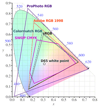
Diagram of the differences in gamut amongst the various color spaces.
The web can only handle sRGB. If you export an image in the other color spaces, many of the colors — reds and bright yellows, for example — may go out of gamut and because they cannot be rendered on the Internet, they dull or lighten your image. When we convert to sRGB for web use, we are allowing our programs to take into account the differences and make the appropriate color substitutions.
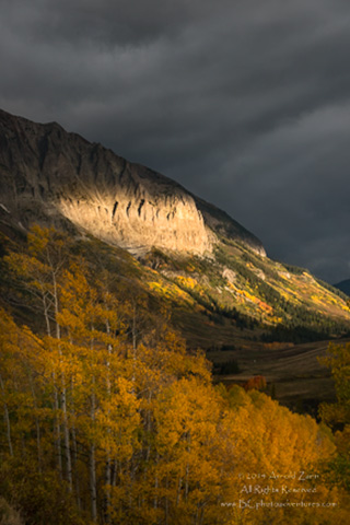
In the example below, you can see how Arnie’s photograph actually looks paler in ProPhoto RGB then in the sRGB version. It is subtle, but if you look at the yellows and oranges within the trees and examine the cliffs, they look a tad washed out in the lower rendition. Also, the sky looks less dramatic.

© 2014 Arnie Zann. All rights reserved.
sRGB version
© 2014 Arnie Zann. All rights reserved.
ProPhoto RGB
You may remember seeing something called icc profiles. ICC stands for International Color Consortium, a group that seeks to help standardize colors internationally. The organization states as its mission, “The purpose of the ICC is to promote the use and adoption of open, vendor-neutral, cross-platform color management systems.”
CALIBRATION
There is no standardization in cameras and the way they interpret color. Neither is there standardization in monitors and the way they render color.
Calibrating your monitor is critical to the success of your presenting your images, whether on the Internet or in a print. We use , but is another excellent brand.
Per Mr. Robertson, “Calibration is necessary to bring the monitor to a standard baseline of brightness, color temperature and gamma. It is done by changing the physical controls on the monitor. The standards are generally as follows:
Color temperature of 6500K;
Luminance (brightness) of 110 to 120 cd/square meter; and
Gamma of 2.2.”
If the monitor is not calibrated properly, then it is virtually impossible to match the look of the monitor image and the final print. The biggest mistake that people make is having the brightness of their monitor set too high.
And profiling is done with software. It cannot be achieved by changing the physical controls on the monitor.”
Those photos you uploaded to the Web don’t look as they did on your monitor? Hmmm … Dollars to those proverbial donuts that you have not calibrated your monitor!
ADJUSTMENTS
For both print and web, you may find that you need to lighten/brighten your image by .2 to.25. It will, of course, depend upon the image, and with practice and experience, you will be able to better anticipate what a certain image will need.
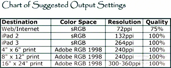
STARTER SUGGESTIONS
Here are some suggestions to get you started, but do not take these as the gospel — I do not have the proper connections for that.
Hopefully, this will help at least some of you, and serve as a reminder to others, as you process your images and output/export them for various uses.
And be sure to check out John Watts articles on Color Management and Printing.
by Margo Taussig Pinkerton (aka, TBC–The Barefoot Contessa)
Barefoot Contessa Photo Adventures with Margo Taussig Pinkerton and Arnie Zann
Article: © 2014 Margo Taussig Pinkerton. All right reserved.
Leave a Reply