
Whether you’re creating portrait, landscape or abstract photographs, establishing contrast is one of the most important things to consider. After all, contrast is one of the principles of good photographic composition.
So what is visual contrast? How does it work?
According to the dictionary, contrast is the state of being strikingly different from something else, typically something in juxtaposition or close association. I think we all have a pretty good feel of what something is when it is in contrast with an opposing element. But how does this relate to photography?
As humans we like variety. If you play your favorite song to death you will get tired of it; if you overindulge in your favorite snack, eventually your palate will seek fresh flavors.
In the same way our eyes seek new interest and find excitement in difference. This is why most successful compositions use some form of contrast to create variety and generate visual intrigue. Contrast attracts the eye, adds visual interest to a composition and can be presented in many different forms.
As a result, the elements used in a photograph can become more powerful. There are many ways to introduce contrast in your images. Let’s have a look at seven most common examples.
1. Shape Contrast
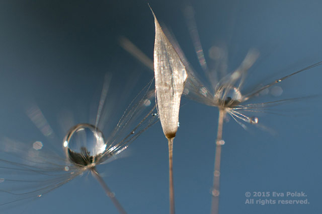
Shape contrast means making things stand out by organizing together a variety of shapes. Some shapes are geometric. These are circles, squares, rectangles, triangles, and so on. Free-form or organic shapes are generally irregular and uneven.
Plants, rock formations, clouds, animals, and the human body are all considered to be free-form shapes. You will show the highest contrast in a photograph by using organic shapes and geometric shapes together.
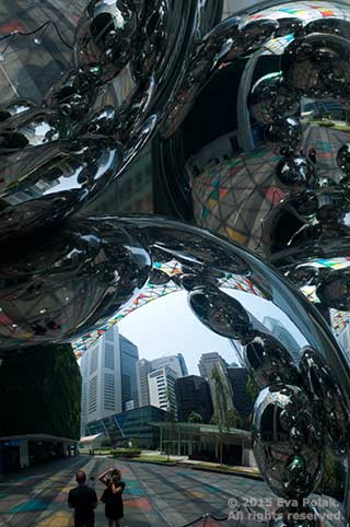
2. Size Contrast (small versus big)
The next most common form of contrast is that of size. It is the easiest way to establish a focal point in an image. Something big next to something small generally indicates that the bigger item is far more important. This difference in size adds visual interest and is used to show depth, variety and emphasis.
Also, placing a small element against a larger element brings a sense of majesty and awe to an image. The impact of scale in a photograph is more powerful if the relationship between elements and their size is unexpected.
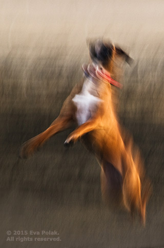
3. Texture Contrast
Texture refers to the surface quality or feel of an object. Shiny and dull, smooth and rough – these are some contrasts in texture that you can find and capture around you. This difference in texture adds visual interest and can help to establish a focal point.
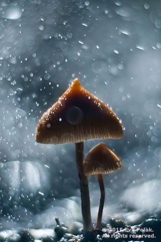
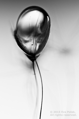
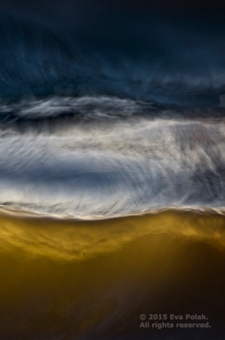
4. Tonal Contrast
Tonal contrast is created when light tones and dark tones lie alongside each other; it is usually described as high, low or normal. The greater the difference, the more attention the area attracts. Low contrast images have little or no highlights or shadows.
A high contrast image consists of mainly blacks and whites with very few grays. Images with contrast in the normal range will have a few blacks and whites with a broad range of grays in between. High contrast will give you drama while low contrast will give you a calm feeling.
Tonal contrast is one of the most powerful tools we have to define the center of interest in a photograph.
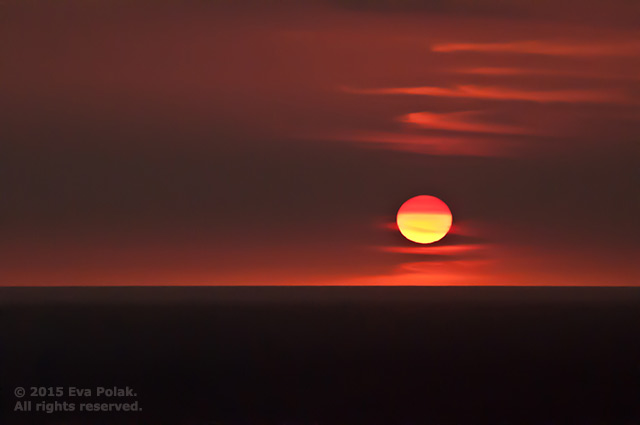
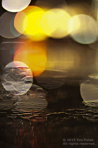
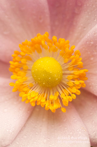
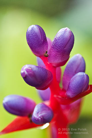
5. Color Contrast
The best way to create contrast using just color is to use complementary colors in your images as they provide the highest level of contrast among colors. Complementary colors are colors that are located directly across from each other on the color wheel. Red and green, blue and orange, and purple and yellow are all examples of this. An image with good color contrast can look great even without any tonal contrast.
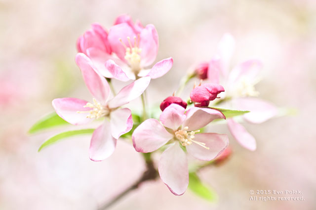
6. Color Saturation Contrast
This type of contrast shows a clear difference between highly saturated color and desaturated color. The more vibrant the colors, the more contrast. This difference in saturation, or color brightness, adds visual interest and helps to give prominence to your subject.
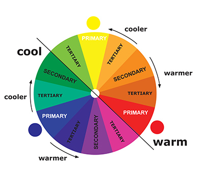
7. Warm – Cool Color Contrast
All colors can be placed somewhere on the temperature scale. The warm end of the spectrum is dominated by reds, oranges, yellows and pinks, while the cool end is dominated by purples, blues and greens.
Using temperature contrast to good effect in an image involves combining a color from one group to set against one or more colors from the other. Generating visual impact through color contrast works best if you restrict yourself to a limited palette. When you use fewer colors in your photograph, the more dramatic the contrast will be.
.jpg)
As you can see there is so much more to contrast than just “light and dark” – it’s one of the most important principles in design and you can almost never have too much of it, provided that you use it properly. Contrast is everywhere and a part of everything we see. Explore contrast in detail, use it to its full potential, and take your photography to the next level.
By Eva Polak
Article and photos: © 2015 Eva Polak . All rights reserved.
I highly recommend Eva Polak to everyone, who wants to be a better photographer