
Adjusting proper intensity, contrast range, and color balance represents the most difficult operation to execute well for photographers using computer-imaging programs. The problem is to achieve repeatable results in a reasonable period of time. When you try to print your images, you may find that your monitor is not the best reference for adjustment. The solution is to measure the parameters of your image using proper measurement tools (available in most good imaging programs) and to coordinate the image parameters–not for what you see on the screen, but for proper numerical targets based on standards accepted by the imaging industry. This technique yields reproducible results that can be compared against known standards.
The following procedures were derived over a number of years of using Photoshop (versions 4/5) plus intensive reading and experimentation with the images produced on monitors and by printers. Considering the complex learning process involved in image manipulation, you may find that additional modification of these techniques is necessary. However, if you use the information presented here, you’ll approximate your ultimate goal. (Newer versions of Photoshop and other comparable programs will necessitate similar measurements and adjustments, but the tool menu procedures may be different.)
Note: In the following steps, adjustments should be as close to the specified numbers as possible. However, small variations won’t cause problems. All procedures assume use of Photoshop 4/5 in a Windows environment.
ADJUSTING AN IMAGE TO TAKE FULL ADVANTAGE OF PRINTER CONTRAST RANGE
1. Open the image on the screen. You’re going to make adjustments on a channel-by-channel basis, so you open the utility that allows you to switch between RGB channels.
2. Window-Show Channels: To make measurements on our image, we need to use the Photoshop densitometer. Choose the EYEDROPPER TOOL, and press <ENTER> to show the eyedropper palette.
3. In EYEDROPPER OPTIONS, set SAMPLE SIZE for “3×3 average.” This controls the size of the “sample” when you measure image parameters.
4. In the eyedropper palette, click the INFO tab, or activate WINDOW – SHOW INFO. This will be used in later procedures to measure image parameters.
Note: Do your adjustments on a channel-by-channel basis for best results.
5. In CHANNELS, choose Red.
Image – adjust – levels: What you see is a “histogram” that indicates the distribution of pixels across the possible contrast range of the image (horizontal axis) and the relative number of those pixels (vertical axis). Without adjustment, the possible contrast range of the image often extends beyond the existing pixels. It’s advantageous to limit the contrast range slightly, so that your printer can reproduce everything that’s included inside that contrast range.
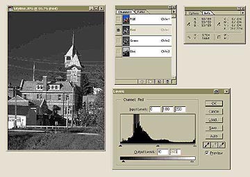
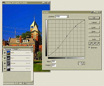
This image shows the screen snapshot of the “Levels” tool being used. In the upper right-hand-side of the screen, the “Channels” window is shown on the left, with the Red channel active. The right-hand window shows the “Info” window. These two windows will remain on the screen for most color correction activity.
Below these two windows is the “Levels” screen, showing the image histogram. This histogram shows the distribution of pixels in the image, and their relative number. Directly below the horizontal axis of the histogram are three arrows, which may be moved to control the highlight (right), shadow (left) and midtone (middle) values.
Under the histogram is a scale graph, 0-250, which depicts the maximum range over which the pixels of the histogram may be distributed. Note that the limits of this image have been set to 10 and 245, to better make use of a printer’s contrast range.
6. On the INPUT LEVELS histogram, underneath the graph, move the left arrow (black point adjustment) underneath the first actual image pixels in the graph. Move the middle arrow (midtone point) back toward the left by the same amount that the left arrow was moved. Repeat for the right arrow (white point adjustment) and middle arrow. This procedure ensures that you’re not “wasting” contrast range on non-existent pixels.
7. On the OUTPUT LEVELS bar graph underneath the histogram, adjust the left arrow for 10. Adjust the right arrow for 245. Press OK. This limits contrast range to what most printers are capable of reproducing. These numbers are accepted as printing industry standards.
8. Repeat procedures 6-9 for the Green and Blue channels.
9. Change CHANNELS back to RGB.
ADJUSTING IMAGE FOR MAXIMUM USABLE CONTRAST RANGE AND COLOR BALANCE BETWEEN CHANNELS
The following procedures depend on measurements you’ll make on your image using the Photoshop densitometer utility, the INFO palette. By making measurements of non-reflective highlights (highlights not derived from reflections on water, metal, etc., that are very bright), you’ll ensure that your printer will reproduce detail in the brighter parts of the image. The reflections (often called specular highlights) will “blow out” with overexposure, which our eyes will accept.
10. Move the eyedropper tool over the brightest non-reflective highlight in the image, watching for the highest possible numbers. Record the INFO measurements (e.g.245/240/247). The ideal is 245/245/245.
In a similar fashion, we would like to see detail in as much of the shadow area as is possible.
11. Repeat for the darkest area of the image, watching for the lowest possible numbers (e.g. 42/42/31). The ideal is 10/10/10.
Measurements using the CURVES tool should, in general, be done on a channel-by-channel basis.
12. Choose the Red channel.
13.Image – adjust – curves: <ALT> – “CLICK” (left mouse button) in the graph area, to increase the graph resolution to maximum. This produces many more grid lines over the graph, giving you better control.
14. Click the small square in the upper right-hand corner. This will increase your graph area to its maximum possible size. Since you’ll be adjusting the image “by the numbers” and not by looking at the image, covering up the image is not important.
15. Click on the center of the diagonal line to set a “lock” point. Try not to move the line up or down. Repeat twice more at the points on the line that are halfway between the mid -point and the ends. This locks the mid-tone areas of the line in place before shadow and highlight adjustments are done. The diagonal line is really the “curve” in the CURVES tool.
16. Adjust the highlight area of the curve. Click the mouse in the blank graph area above the curve. Move the mouse horizontally toward the top of the curve until the INPUT number matches the first (red) number in your highlight measurement. Move the mouse vertically until OUTPUT indicates 245. Click the left mouse button to force the curve to pass through this point, creating a lock point on the curve at this point.
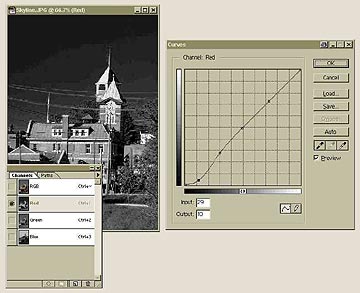
The screen snapshot shows that the “Channels” window (lower left corner) has been set to the Red channel. Looking at the “Curves” tool (right-hand side), we see that the shadow area of the curve has been readjusted from a value of 29, to a value of 10. Obviously, prior measurements with the “Info” window and the “Eyedropper” tool showed a shadow level of only 29, in the darkest area of the Red channel.
In a manner similar to the highlight adjustment, three locking points were first established on the curve, in the middle, and lower- and upper- levels. The cursor was then moved horizontally over the shadow area of the curve, until the Input box indicated a position of 29. The cursor was then moved vertically until the Output box showed a value of 10. Clicking the mouse forced the shadow end of the curve to re-establish itself so as to pass through the new value.
17. Repeat the above technique for the shadow adjustment. Click the mouse in the blank graph area below the curve. Move the mouse horizontally toward the bottom of the curve until the INPUT number matches the first (red) number in your shadow measurement. Move the mouse vertically until the OUTPUT reads 10. Click to force the curve to pass through this point, creating a lock point on the curve at this point.
18. If the curve has produced sharp bends, move the nearest lock point to readjust the curve for smooth transitions.
19. Repeat 14-20 for the Green and Blue channels. (Green is the middle number in steps 12 and 13 and Blue is the last number in steps 12 and 13)
20. Return to the RGB channel. Repeat your highlight and shadow measurements. Repeat the above adjustments, as necessary.
21. Using the eyedropper tool and INFO, check the neutral color areas (close to “gray”) of the image, if any. Ideally, you should measure equal numbers. Note: Be careful if you try re-adjusting neutral areas of the curves for the ideal numbers, as it’s easy to introduce color shifts. Often, it’s better to leave them as they are.
ADJUSTING THE IMAGE TO CORRECT SPECIFIC COLOR SHIFTS
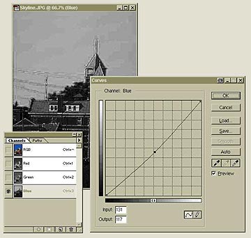
The “Curves” tool is being used, in this screen snapshot, to reduce or eliminate a blue color cast in the image. The “Channels” window (lower left-hand side of the screen) shows that the Blue channel is active. The photograph is showing only one color.
The “Curves” window (lower right-hand side) shows that the curve has been lowered, from position 131 to position 117 (the dot on the screen shows where the adjustment is being made), which will decrease the overall amount of blue colour in the image. The numbers in question are shown in the Input/Output boxes below the curve.
A discerning eye will often observe that an image has a slight blue colorcast or, perhaps, a slight magenta colorcast. Gray pavement should be gray and not blue. Blue skies should not have a pink tinge. Colorcasts are best adjusted on a channel-by-channel basis by increasing or reducing the color in question. Colors other than RGB may be adjusted after some study of how colors mix, by experimenting with adjustment of several channels. Keep careful notes!
22. If color balance requires adjustment, make the changes in the middle of the curve (mid-tone area) for the CHANNEL color in question. Pull the curve up to intensify the CHANNEL color, down to reduce its intensity. An adjustment from position 131 (on the curve) to position 117 usually shows a significant change in colorcast. Return to the RGB channel, and use EDIT – UNDO, or <CTRL>X, to see ‘before and after’ effects.
ADJUSTING IMAGE FOR OVERALL BRIGHTNESS/CONTRAST LEVEL
These next adjustments should be done gently. Check the results after each change. It’s better to make progressive changes, rather than one big one. You may wish to save intermediate results, or use different image layers for each change. These adjustments are easier to make on the RGB channel.
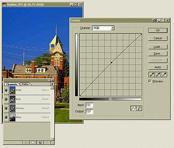
The Photoshop screen shown here illustrates the “Brightness” adjustment of the entire image, using the “Curves” tool. The “Channels” window that overlaps the photograph shows that the RGB channel has been activated, so the “Curves” tool (shown to the right of the photo) is acting on all three RGB channels at once. The slight upwards bend of the curve shows that overall brightening is being implemented for this image. In this adjustment, the point on the curve (at location 131) has been raised to its new location, at position 137.
The Input/Output boxes at the bottom of the “Levels” window allow you to see exactly what effect you are having on the curve, or allow you to specify numbers to which you would like the curve to be adjusted.
By working on the RGB channel, you can see the immediate effect on the entire image.
23. If the overall appearance of the image is still underexposed, adjust the middle part of the curve for the RGB channel upwards, checking after each adjustment for the highlight values using the eyedropper tool and the INFO palette. After modification, ensure that you haven’t introduced any color shifts in the overall image. An adjustment from position 131 (on the curve) to 137-140 should show a marked improvement in brightness.
The “Curves” tool is being used here to increase the overall contrast of the photograph. The “Channels” window in the lower left corner shows that the RGB channel is active, so contrast of the entire image is being adjusted.
The “Curves” tool (right-hand side of the image) has been adjusted in the following fashion:
First, the center of the curve was locked in place (middle dot). The shadow section of the curve (bottom left corner) has been pulled down (lower dot), and the highlight section of the curve (upper right corner) has been pulled up. The shadows and highlights of the image have been intensified, while the midtones have been left alone.
How much adjustment is made depends on the image, and the photographer’s preferences. However, a series of small adjustments is always better than one huge one.
24. The overall contrast of the image may be adjusted by increasing the steepness of the RGB curve (or by modifying each CHANNEL curve). This modification is attained by locking the middle of the curve, then pulling down slightly on the curve below the lock, and pulling up on the curve above the lock. The resulting curve takes on an “s-shaped” appearance, rather than a straight line. Note: Be sure to check your highlight and shadow measurements after making this change. You can always change your mind with EDIT – UNDO.
NOTES ON USING CURVES: LOCATING SPECIFIC AREAS THAT NEED MORE ADJUSTMENT
Moving the eyedropper cursor in the image area, while depressing the left mouse button, will move a circle up and down your CHANNEL curve, showing you which part of the image your present curve location represents. If the image is too bright or dark at that point or needs color correction, you can lock the rest of the curve in place and concentrate on that area.
FINE – TUNING THE IMAGE
You can place “control points” (up to 14) on the curve to carefully fine-tune the image, and you can do it channel by channel. You can remove control points by simply dragging them off the curve. Making part of the curve steeper adds contrast in that area. Contrast should be adjusted on a channel-by-channel basis, checking each time with the RGB channel as a reference.
ADJUSTING SKIN TONES
For white skin in an RGB image, the red levels are much higher than green or blue. Typically, the red levels should be 50% stronger than the green and twice as strong as the blue (e.g. R150, G100, B90). Asian and African skin will have less red than green and blue.
SAVING AND RETRIEVING ADJUSTED CURVES
Note that, while you’re in the CURVES, you can save the curve you’ve just modified and come back to it at any time for further adjustment. Once you’ve finished with the stored curves, delete them from your image. You’ll find each curve as an “ACV” file in the hard drive folder where your image is stored. While making adjustments, pressing <CTRL> <ALT> <M> will return you to the last curve you adjusted.
MAKING THE BRIGHT COLORS POP IN YOUR IMAGE
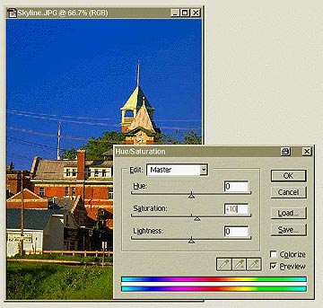
This image shows the overall photograph being adjusted for color saturation, using the “Hue/Saturation” tool. Saturation has been increased by a factor of +10, a slight adjustment suitable for most photographs.
25. Image – adjust – hue/saturation: Dial in about +10 saturation.
Check your results with EDIT – UNDO, or <CTRL> Z.
Don’t overdo it. All of these adjustments take some practice.
SHARPENING THE FINAL IMAGE
Generally, a scanned image won’t be as sharp as you might wish. The Photoshop sharpening tool that’s most useful is the UNSHARP MASK (the odd name is lost in the pages of printing industry pre-history), because you can make three separate adjustments on the tool. Imaging literature tends to favor sharpening only after all the other adjustments have been made. For best results, sharpening should be done on a channel-by-channel basis, as well.
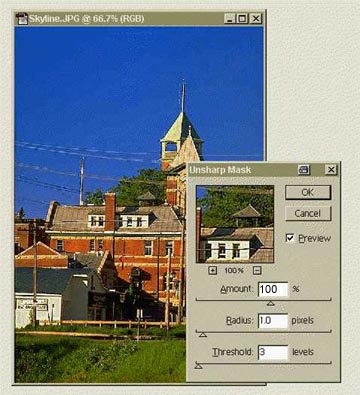
This image shows the photograph being adjusted for sharpness, using the “Unsharp Mask” filter.
The filter has been adjusted for a radius of 1 and a threshold of 3, good values with which to start. The amount of sharpening has been set to 100, a typical value for large image files. Additional sharpening might be necessary after this first stage.
26. Filter – unsharp mask: Start with a RADIUS of 1 and a THRESHOLD of 3. For images of file size of 50K or less, begin with an amount of 50%. For larger images, increase this to 100%. Sharpening should be done in gentle stages, rather than with a quantum leap. Excessive sharpening will cause “ghosts” around large objects in your prints.
by Michael Goldstein
Leave a Reply