
RGB COLOR CORRECTION
1. Go to IMAGE–>ADJUST–>THRESHOLD.
2. Drag the slider to the right and left, to find the highlight/shadow areas.
3. Use the EYEDROPPER tool in the INFO PALETTE to measure the numbers for highlight and shadow areas. Compare the highlight areas for the ideal of 245/245/245, and the shadow areas for 10/10/10.
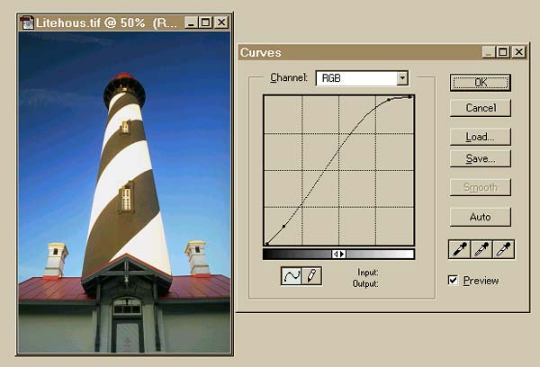
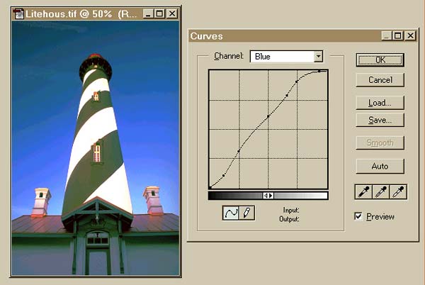
4. Use the CURVES tool to map values into the ideal aim points (you can use the CURVES tool on all three channels at once, or on the individual RGB channels one at a time). It’s better to work on the channels one at a time. Begin with the RED channel, then proceed to the GREEN, and BLUE channels in turn. (See below)
a.) Place the EYEDROPPER in the highlight area(s) of the image. If you press your left mouse button, a small circle will appear on the curve, indicating that part of the curve that affects the highlight areas of the image. Locate the shadow and midtone areas of the curve in the same way. (In an RGB image, the highlight part of the curve is the upper right, while the shadow area is in the lower left part of the curve.)
b.) Begin by adjusting the highlight areas. Click your mouse in the shadow and midtone areas of the curve, to lock the curve in place in those areas. Now, drag the highlight part of the curve upwards, watching input/output numbers, until you achieve the ideal numbers. Once the output number shows the ideal, check in the image highlight areas with the EYEDROPPER, to see if it’s now correct. If not, adjust the highlight area of the curve more carefully.
You can place “control points” (up to 14) on the curve, so you can carefully fine-tune the image, and you can do it channel by channel. You can remove control points by simply dragging them off the curve. Making part of the curve steeper adds contrast in that area.
c.) Correct for the proper shadow area numbers using the same method. Click your mouse in the highlight and midtone areas to lock the curve in place in those areas, then drag the mouse in the shadow part of the curve until the output numbers are ideal. Check with the EYEDROPPER in the shadow areas of the image to see if more adjustment is necessary. Click <OK> to apply your changes to the image.
d.) If your image is not as bright as you would like, you can again enter the CURVES, and using the RGB channel (all three channels adjusted at the same time), try raising the midtone area of the curve until the image appears as bright as you wish. Recheck the aim points for highlights and shadows in your image with the EYEDROPPER, to confirm that they’re still correct.
CMYK Color Correction
In a CMYK image, the highlight areas are shown are in the bottom left corner, and the shadow areas in the upper right corner. If you drag the curve up, the image gets darker. Use the CURVES in the same way as described earlier, to correct CMYK images, channel by channel.
First, measure the image for the tonal values in the highlights and shadows, then adjust the channel CURVES for the ideal highlight aim points (5%, 3%, 3%, 0%), and shadow aim points (70%, 60%, 60% and 90%). Beware of color shifts if you try to increase overall brightness, by changing all four channels at the same time. If the EYEDROPPER shows your neutral midtones have too much cyan, magenta, yellow or black, You must do some fine-tuning on the image.
Using the keyboard command <CTRL> <ALT> <M>, return to the curves you just adjusted. Now, locate the midtone area of the curve using the EYEDROPPER tool. Lock the highlight and shadow areas of the curve in place, and raise or lower the midtone part of the curve until your color levels have equalized, with no black, and perhaps a slight dominance of cyan, the weakest ink.
SKIN TONES
For “white” skin in CMYK, cyan levels should be 1/3 – 1/5 those of magenta and yellow. The magenta and yellow should be about equal, perhaps the magenta just a bit stronger than the yellow. In RGB, the red levels are much higher than green or blue. Typically, the red levels should be 50% stronger than the green, and twice as strong as the blue (R150, G100, B90).
For darker/lighter skin tones, or those with a different colorcast, CURVES may be used as before to introduce the necessary changes. African and Asian skin will have less red than green or blue (RGB), or less magenta than cyan or yellow (CYMK).
ENHANCING CONTRAST
The trick in enhancing contrast is to do it on a channel-by-channel basis. The key concept here is that, looking at the curves, the contrast will be greatest where the curves are the steepest.
1. Moving the EYEDROPPER tool in the image shows where you are on the curve. (A little circle moves up and down the curve as you move the EYEDROPPER. You may have to depress the left mouse button).
2. By locking in the 1/4 and 3/4 areas, you can make the midtone curve area a bit steeper, thus increasing the contrast. You can do this in either RGB or CMYK. For each channel, the EYEDROPPER shows where on the curve the midtone detail appears. The area of the curve varies, channel to channel, and it’s this area of the curve that you want to make steeper. Using this technique, you can change the contrast in any part of your image, without affecting the other areas.
ADVANCED TECHNIQUES
The advanced techniques that follow are not as “cut-and-dried” as the material we’ve already studied. There’s more experimental leeway here for you to achieve the effect you desire.
SHARPENING
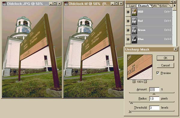
Sharpening should also be applied, in RGB or CYMK, on a channel by channel basis, using the UNSHARP MASK.
FILTER –>SHARPEN–>UNSHARP MASK
Typical values with which to start are:
Amount: 100
Radius: 1
Threshold: 3 – 30
(In CMYK, try sharpening only the black channel, to avoid increasing noise in the other channels.)
The adjustments on the UNSHARP MASK may all be changed, to obtain just the degree of sharpening that your image requires. The danger is that you’ll over-sharpen and not the reverse.
ADJUSTMENT LAYERS
By creating separate adjustment layers (CURVES, LEVELS, etc.), you can make modifications on separate transparent layers, on top of the original image, without affecting the original. You can go back and edit or remove all or some of these layers, without affecting the original image.
Creating Adjustment Layers From The Layers Palette
LAYER –>NEW–>ADJUSTMENT LAYER: You can make a new CURVES layer, a LEVELS layer, or a layer that allows use of other color correction tools. You work on a separate transparent layer, that overlays the original image. You can remove an adjustment layer afterwards, and its effect, or edit it. When you’re satisfied with the effect, you should blend the layers with the original image.
LAYER–>FLATTEN IMAGE: Note that some Photoshop facilities may not work on the “layered” image, until you flatten it.
CHANNEL BLENDING
For CMYK images with severe colorcasts, you may not be able to correct them using only the CURVES tool. However, by blending one channel with another. You can take tonal information from one, overlay it on top of another, and correct the image in that manner.
Here is the technique to use:
1. WINDOW–>SHOW CHANNELS Analyze the image, channel by channel with the EYEDROPPER and INFO palette, to look at the relative color intensities.
2. Select the channel from which tonal information will be used for correction. Select the entire channel information, and copy it to the CLIPBOARD (EDIT–>COPY).
3. Select the channel that requires correction, and PASTE the CLIPBOARD information on top of it (EDIT –>PASTE).
Working Between Color Models
You can also work between color models, using blending techniques. You can “steal tonal information in an RGB color model of the image, to enhance or correct a channel in the CMYK version of the image”. (This technique is rather esoteric, but works very well.) For example, if you have a CMYK image with a severe red color cast, it could be because the cyan channel is very weak. You can check this using WINDOW–>SHOW CHANNELS. You can borrow channel information from the red channel in the equivalent RGB color model of the picture.
Channel Blending Technique
1. Display the image to be corrected.
2. Choose IMAGE–>DUPLICATE and accept the default filename (unless you’re fussy!). Create a duplicate of your image.
3. Change its color mode to RGB, using IMAGE –>MODE.
4. Go to the original image and choose (in this case) the cyan channel.
5. Choose IMAGE–>APPLY IMAGE. Choose the red channel of the copy image as the “source” (this is selectable). The “target” should be shown as the cyan channel of the original image.
6. In BLENDING, choose OVERLAY. Adjust the opacity for 50% (this will need some experimenting) and press <OK>.
HOW TO TEST YOUR PRINTER’S ABILITY TO REPRODUCE HIGHLIGHT/SHADOW DETAIL
This technique will show you the ideal “aim points” that you need for your printer, with the paper you are using.
1. In any layout or drawing program, draw a little box, label it, then fill it with a 1% gray. CMYK 0-0-0-1 produces 1% gray.
2. Copy this box, making twenty-four additional copies on the page.
3. Label the boxes 1 – 10 for the highlight areas, and 85 – 95 for the shadow areas.
4. Fill each box with the appropriate amount of gray or black. (This is our highlight/shadow calibration scale.)
5. Print the chart, to see how your printer handles highlight/shadow details. This will change with different papers.
Yes, it’s true – the information in this article argues the validity of some technique I described in my prior article, “Photoshop for Photographers”! Such is the learning process. I can now color correct images in about ten minutes, where before it would before have taken hours, with no specific approach that I could duplicate later. “Cut-and-try” is fine, but a well-defined method that is numerically based will result in faster and better images.
by Michael Goldstein
Leave a Reply