
There are two tools that I consider essential to working with contrast and color in Photoshop: Levels and Hue / Saturation. In a previous article, I showed you the “8 Basic Elements of a Good Color Print”. In a well-exposed image, it is quite possible that Levels and Hue / Saturation are the only 2 tools that you’ll need for working with the first 4 elements: Contrast, Color Balance, Luminance, and Color Saturation.
Oh, and for reference, here is an article I wrote previously on the “Levels Adjustment Layer”.
A quick note: I find the generic tools such as the “Brightness /Contrast” or “Color Balance” tools are too global or destructive to the image to be of any major use, so I never use them. Instead, I use Levels and Hue-Saturation in conjunction with each other, which gives me much more control, resulting in strikingly better results.
Now let’s talk about Hue / Saturation, but first, a few definitions are in order.
The 3 main attributes/components of color are Hue, Saturation, and Luminance.
1.) Hue: Hue is a single color cast or color name. Green is a hue, orange is a hue, and so on. There are an infinite number of hues …
2.) Luminance: Luminance is the amount of perceived brightness of a color. The color black has no luminance, whereas the color white has the highest luminance.
3.) Saturation: Saturation is the intensity, purity or amount of a hue.
The Purpose of Hue / Saturation:
The Hue / Saturation Adjustment Layer is used for color correction. More specifically, it allows you to control Hue, Saturation and Luminance for each color channel.
Hue / Saturation is great for changing the characteristics of a particular color, not your overall “global” color. When you make changes to a particular Hue, none of the other colors in your image are affected.
For instance, if the Reds in your image are too saturated, you would simply choose the “Red” Channel from the Drop-Down menu to desaturate your Reds to the desired level, without affecting any other colors in your image.
Or let’s say that the Greens in your landscape shot are too Blue/Green: Choose the “Green”Channel from the Drop-Down menu, then change the Hue to bring your Greens back to a more realistic color, such as Forest Green, again without affecting any other colors in your image.
Where to Find: Three places, in order of ease of access:
1.) You can find it in the Adjustments Panel in CS4, 5 and 6, as well as Elements 7 & 8.
2.) You can click on the “New Adjustment Layer” button in the Layers Panel (the faux “Yin-Yang” button) and choose Hue – Saturation in the drop-down list.
3.) You can also go to the “Layers” menu -> “New Adjustment Layer” and choose it from that menu.
|
|
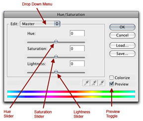
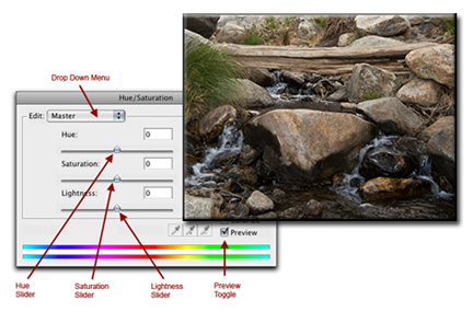
How Hue / Saturation Works:
The Dialog Box (shown above for earlier versions of Photoshop) for Hue / Saturation is very intuitive:
1.) Choose the Color Channel that you want to adjust from the Drop-Down menu (you have 6 to choose from – The 3 Primary Colors, as well as the 3 Complementary Colors). By the way, I rarely use the “Master” channel. I find that I have much more control by choosing a single color channel to make changes.
2.)Adjust the Hue: As an example, choose the “Green” channel from the Drop-Down menu. Ever heard of the Color Wheel? If not, Click Here because you should be using it. Now you will see it in action.
~ As you move the “Hue” slider to the left, you will see the green values in your image go from a green cast to a yellow cast, then to a red cast, and finally end up with a magenta cast.
~ As you move the “Hue” slider to the right, you’ll see your green values go from a green cast to a cyan cast, then to a blue cast, and finally to a magenta cast.
3.) Adjust the Saturation: Again, using the “Green” Channel as an example, move the “Saturation” slider all the way to the right and you’ll see the effect of way too much saturation. Conversely, if you move the slider all the way to the left, your green values will turn to shades of black and white.
4.) Adjust the Lightness: I rarely use this slider. I personally find it ineffective. It is more effective and less destructive to adjust your Lightness with Levels and/or Curves.
Below, you will find two “real-life” examples of how to use Hue / Saturation, followed by commentary as to what was done and why.
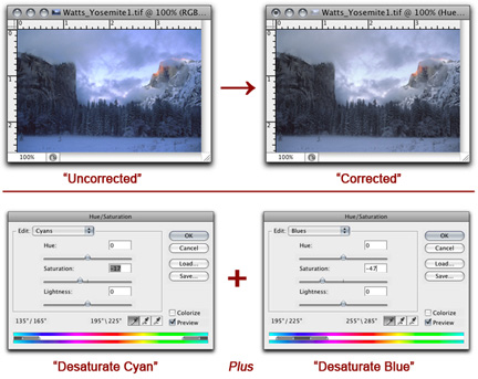
The example above is a correction for Saturation only:
The Uncorrected Image needs to be warmed up, but not globally. The color bias is showing up as too much blue and cyan in the snow, clouds and trees.
The Corrected Image is more natural looking. To achieve this, the “Cyan” Channel is desaturated, plus the “Blue” Channel is also desaturated.
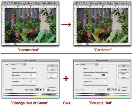
This example above is a correction for Hue and Saturation:
In the Uncorrected Image, the greens are way too cool, with a blue bias. The terra-cotta pots are a bit desaturated. The rest of the image looks fine.
The Corrected Image is more pleasing. To achieve this, the “Green” Channel’s“Hue” Slider is moved to the left, and the saturation in the “Red” Channel is increased.
by John Watts, Watts Digital Imaging
Leave a Reply