
Photography (from the Greek language: photos, meaning light, and graphein, meaning writing) was intended as a chance to fix an object using light to permanently reproduce its visual traits onto photosensitive surfaces. Its foundations began with chemistry. Further experiments focused on the choice of a photosensitive material and on fixing, as well. Chemistry remained the most beaten track in research for some years, even after Joseph Nicéphore Niepce.
The equipment used to create images and to render the peculiar qualities of the light was a secondary priority. Although, even then, light was considered essential to producing a snapshot, it was not yet hailed as capable of determining the quality of the image or available as a tool for creativity.
What is light in photography? To know and to understand light– not only from a scientific point of view (i.e. as electromagnetic frequency), but also as the main element for photographic “writing,” we should refer to Aristotle. He redefined Plato’s idea in which vision takes its origin from a fire burning inside the eye that, once it escapes, comes across “daily light” forming a “visual body.”
For the first time, Aristotle stressed the concept that vision is not a point of contact between inner and outer light. Moreover, light is not even a “body.” It is, therefore, no fire, no star, and no sun. It’s the emanation either of a body or a source of light.
Actually, if we ask a physician, a painter, an electrician, and a photographer for a definition of “light,” we might get a different answer from each of them. It would be affected by both a subjective perception and by the specific knowledge of each at the same time.
Technically speaking, we should know light is an electromagnetic frequency that is defined as the “visible spectrum” portion of the electromagnetic spectrum. However, in photography we should consider the opposite concept: light is actually invisible.
Let’s imagine a source of light–a flashlight, for instance. Let’s hide the flashlight so we can no longer see it, and then let’s move it so its ray of light crosses through a dark, dry, dustless space. The ray of light will be invisible, at least until we interrupt it using either an object or a hand. So, if we perceive the presence of light only because of a body lying its way, it means that what we do see is no light at all, but the lit objects.
The objects absorb the spectrum of light according to their material make-up, rejecting what reaches our eyes, thus producing heat. As a matter of fact, we see the green of a leaf because its compositional material absorbs all the other colors of the light except for green. The same goes for gold out of wheat or for anthracite out of the asphalt.


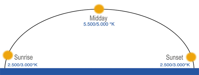
Nevertheless, light does not always show the same characteristics, and the differences are not restricted to the luminous intensity. Among the elements related to photography, Color Temperature (CT) is no doubt among the most remarkable, both from a technical and a creative point of view.
Color Temperature can be measured with degrees Kelvin and, while in photographic film we can choose between two solutions, daylight or tungsten, for digital photography there are no further solutions at our disposal and the nearest value to the CT of the light shining in the environment can be adjusted by the White Balance (WB) definition.
The film and sensors of digital cameras are not “filtered” by the human brain. They reproduce exactly what they see together with the different dominances due to the CT. The human eye is unable to detect these same differences unless the viewer is in front of a comparison between two luminous sources giving out a different CT.
However, the human brain is able to perceive the atmospheres of the different CTs. While we don’t see the dominances at all, we do perceive the sensations the different dominances transmit.
One example that may help us understand how we perceive, even when we don’t realize we’re doing it, is the lighting technique often used in different areas of a supermarket. The meat section is generally lit up by a low reading of °K (3.000-3.500). We don’t consciously see the warm tone of the light, but we get the impression of a blood-red, tasty cut of meat, all the same. Then, once at home, we open the package to discover the same slice of meat appears to be a completely different color.
The bread bakery section is normally lit up by a slightly higher CT (4.000-4.500). These temperatures make the product seem to be surrounded by a golden-yellow color. Detergent products are lit by an even higher CT (more than 6.500). Here the dominant hue is light blue, conveying a sensation of cleanliness. The choice of a suitable CT becomes a useful marketing tool to guide the client through his/her perception of a product and its color, even though the perception is different from reality.
If we can use CT effectively in a supermarket, why can’t we use it in photography, since the CT can be varied by adjusting the White Balance. Indeed, a White Balance adjustment favors the creation of an image without any dominance, so it favors a correct one. However, by intentionally changing it, the WB can be an excellent instrument to use to transfer a different perception of the snapped reality.
To create by adjusting the CT, we should know the proportion between degrees K° and the related dominances that shades of CT assign to the image. If the WB is set differently from the one of the environment we’re shooting, then we get color dominances. It follows that, besides being crucial to obtaining a photo without dominances, if intentionally changed, the WB turns into a key instrument for a creative result.

A low grade of CT sheds a warm light (verging on orange), whereas a high grade of CT sheds a cooler light (verging on light blue). In other words, if I adjust my WB on 3400 °K in an environment lit up by tungsten light, then I will get a photo without dominances. If I adjust it on a higher grade, then the photo will show a dominance verging on red. If I adjust it on a lower grade, then my photo will turn out with a dominance verging on blue.
The attached photo can convey the idea and the atmosphere of sunset or daybreak by simply shooting in broad daylight, adjusting the WB to a higher grade than 5500 °K. Or it can transmit the perception of evening by adjusting the WB to a lower grade.
© Piero Leonardi. All rights reserved.
Reason and Intuition
Finally, opportunities for using light are not limited to lighting the scene. They can be key creative instruments, useful for shooting a subjective reality–our own. With a little creativity, we can transfer our own idea onto the image. Actually, we transfer it onto our own perception, what we want to communicate. It is not just a question of shooting what we have in front of us, but rather of releasing what our sensitivity is able to convey and hopes to transmit to others. We should, in fact, bear in mind that generally a snapshot shows both what we reveal and what we let the others imagine.

WB set on auto–4500 °K

WB set on 8800 °K
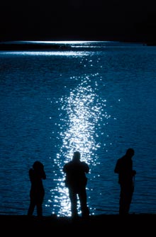
WB set on 2500 °K
Here are three images that have been shot in succession. CT was 4500 °K. In the first photo, the WB has been adjusted on “auto” and, through the information provided by the camera, we know the CT of the light that very moment. In the second picture, the WB has been adjusted on 8800 °K and in the third one on 2500 °K. The strong blue dominance in the third snapshot lets us imagine the reflection of the light on the water is not due to the sun, but instead, to the moon.
Enjoy using light to create your own visual reality.
by Piero Leonardi
Article and photos: © 2011 Piero Leonardi. All right reserved.
Leave a Reply