
“One can only see what one observes, and one observes only things which are already in the mind.”
~ Alphonse Bertillon
Those of you who are familiar with the black-and-white prints created by photography’s masters have seen the power of black-and-white. The beautiful blacks and the exquisite range of tones compel the eye. Often, removing color leaves the essence of a photograph. In Part I of this two-part article, you’ll learn about the channel mixer that professionals use to make digital black-and-whites from color, and when black-and-white works better than color. (Using Photoshop’s channel mixer, tinted black-and-white images are easy to create, as you’ll see in Part II.)
One reason I shoot digital is that I like the option of using color and/or black-and-white from the same capture. Just because an image is taken in color doesn’t mean it has to stay that way. At times, pictures are improved by losing the color, because their composition is better suited to black-and-white.
Consider Bertillon’s quote, “One can only see what one observes…,” and look at potential images without the color. Set your vision to black-and-white in your imagination before making any photographs. This means paying special attention to the shadows and the graphic elements of composition in your pictures. When you practice this shift of attention, you’ll not only find that you can photograph in what you’ve been taught is “bad” light, but you’ll also return to graphic black-and-white printing in the digital darkroom. Your mind will become prepared to observe in black-and-white, and what you’ll see will be startling. This creative discovery adds to the fun of photographic seeing.
Here it may be helpful to ask why and when a color picture works better in B&W. No doubt you’ve done this in your work already, so here are three examples of pictures that started in color but were meant for black-and-white. The subjects are Baltimore sailboats, an ad for metal nails, and a giraffe at Cheyenne Mountain Zoo in Colorado Springs.
1. When the color sets the wrong mood: Sailboats.
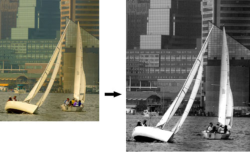
To my eye, the sailing picture is better in black-and-white for two reasons:
First, the sail shapes compliment the geometry of the Baltimore skyscrapers. Second, when the cream color of the sails and the background colors are removed, the original mood returns. The sailboat picture doesn’t need color; the graphic qualities of its composition carry the picture. The triangle shapes of the sails plus the lines of the background buildings provide leading lines of interest.
2. When you want to shift the emphasis: Metal Nails.
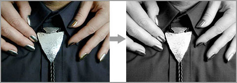
Shooting an ad for a client who sells metal nails, I wanted to make it appear that both the nails and the bolo tie arrowhead were expensive silver. While the digital capture was made in color in the studio, the image was changed to black-and-white using Photoshop’s Channel Mixer. This change shifts the viewer’s attention as the nails and bolo are now the same tone, and not blue, gold and silver as in the color version.
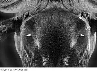
3. When color is distracting: Graphic Giraffe.
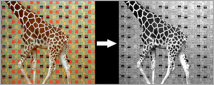
The red-and-yellow wall tiles on the wall behind the giraffe are distracting. Specifically, the dark red of the wall is too close to the brownish red of the giraffe’s hide, and the eye is drawn to both of these colors. In black-and-white, however, this problem goes away. Now the giraffe stands out from the wall, and there is no competing color.
Just for comparison, here is an ad for an antique store that does need its soft gold colors to help set the mood:
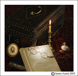
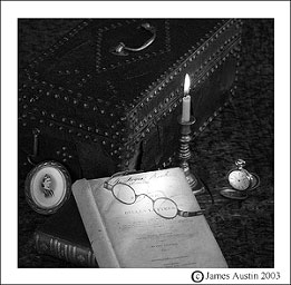
In the color version at left, the warm gold candlelight on the brass helps bring atmosphere and an emotional tone. The black-and-white version on the right does not have the same appeal.
So, how do you change color images into classic black-and-whites?
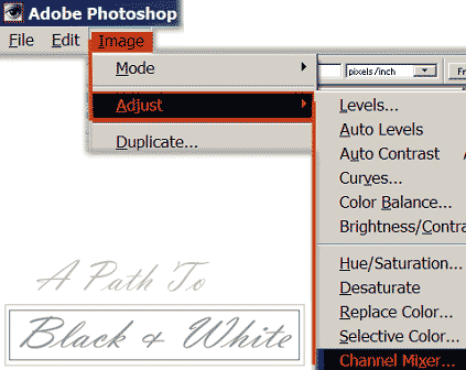
Photoshop experts use Image: Adjust: Channel Mixer. Why? Because you can create high quality black-and-white images, sepia images, and control the amount of detail and contrast. (Adobe Photoshop Elements users should be aware that only the full versions of Photoshop have a channel mixer dialog box.)
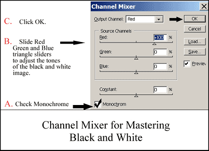
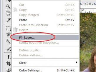
To begin your workflow, make the channels palette visible. Show the channels palette box by clicking Window: Show Channels (or the “Alt” key: the letter “w”: then the letter “h” if you prefer). Click the RGB or top channel to highlight it blue in the channels palette. The next command is Image: Adjust: Channel Mixer. This brings up a dialog box like the one above.
Now, with both channels palette and the channel mixer box both visible, follow steps A to C.
Step A: Check the monochrome box. You now have a color image made up of only gray values. Black now shows up in the picture window in Photoshop, and you work as if you are changing a black-and-white image.
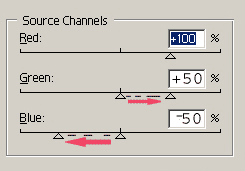
Step B: Change the grays or mid-tones in your picture by clicking on and dragging the red, blue, and green sliders. You have more control here, because you can make subtle changes in the tones and contrast of your picture after you convert it to monochrome. To keep your picture at the correct brightness, make sure the sum of numbers next to the % sign totals up to a positive 100. If red is +100, for example, green is -+50 and blue should be about -50 so that the total of the three is approximately +100. If not, the picture becomes too dark or too bright.
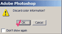
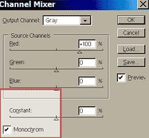
Step C: Click Image: Mode: Grayscale. Remember, it’s helpful to have the channels palette open. You can use the shortcut Ctrl-tilde (~) in Windows or Command – tilde (~) on a Mac. Look at the channels palette. When Photoshop changes the picture to grayscale mode, it throws away the color information, so check “yes” when you get the prompt asking you to do this. With Image: Mode: Grayscale, you’re telling Photoshop to throw away the original RGB working mode. This is a big change. Before you do it, make other editing changes first. Adobe recommends this, and it should be a part of your editing workflow.
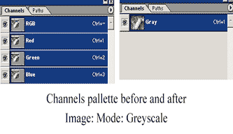
Notice that the red, green and blue channels in the channels palette are reduced to one gray one.
When you do this conversion, the shades of your picture are a representation, by Photoshop, of the luminosity of the original pixels in the original color image.
In part II of this article, we will continue this digital photo adventure and learn how to tint a picture using channel mixer.
By James Austin
Leave a Reply