
I want to take a moment and show you how I look at an image and help you understand why I feel that learning to study and understand photography composition is a wonderful tool that will definitely help you to become a better photographer.
I love teaching and feel fortunate to have made many friends in the process. I really enjoy it when former class participants share with me some of their latest trips and images. Some of them are really terrific photographers and it is a delight for me to see how far they have gone.
Gary Anthes is one of those outstanding photographers and he was kind enough to give me permission to share his work with you so I can illustrate my point.
So, let’s first think about what a photograph really is. If we look at a print, we are really physically looking at a blank piece of paper. It is a one dimensional flat surface.
As photographers, we point our camera and, miracle-of-miracles, an image is captured. It can be a record of what is there or it can be turned into an unforgettable and exciting piece of art.
How to Fully Understand Photography Composition
The decision is made by the photographer’s ability to see, visualize and interpret what is there in a way that captures the viewer’s attention.
Get into the habit of reviewing the many photographs found online and in magazines, books and newspapers. The idea is to survey what is being published and to ask whether the image grabs your attention or do you just flip the page and forget it.
Then really look at the composition of those that grab your attention and ask, why? What is it that makes the image stand out? Is it the lighting? The subject? The texture or color? Was it dramatic? Did you have an emotional response?
What makes that image different than the many others you just pass by? When you can answer those questions you have begun the process of learning to really see an image.
Now it is fine to be able to see well but what happens when you get out in the field and have to make those decisions? I am a firm believer in letting your subconscious lead you here.
If you have really done your homework and looked at many images very carefully and very critically, soon you will get the feeling when you photograph of where you want to stand in relation to the subject and how you want to take the image. It almost becomes intuitive. I stress that this isn’t about copying someone’s ideas and work, but it is about fine tuning your own sense of design and composition.
And when you’re done photographing, take the time to really look and analyze your own images in the same way. Ask yourself the same questions above. Will it grab the viewer’s attention?
So now let’s go to some of Gary’s images and see how he creates his wonderful photo art on his one dimensional flat surface.
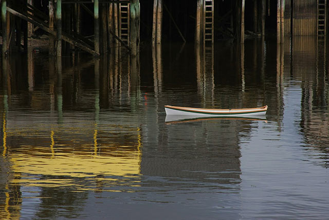
The shape of the small white boat right at the vertical mid-point of the image captures our attention but there is another large yellow shaped reflection that is more in the foreground and just a little larger. It allows our eye to be captured and brought back to the white boat.
Another illusion that tends to be true is that your eye is drawn to the sharpest object in the image. The little white boat is the sharpest object in the image. Look closely at the blue water and see the lovely stair step negative space that leads you right into the pier and the subtle dark ladders and pilings.
Those bring you down to the reflections and then back to the brighter shapes in the image thus capturing your eye and giving you the illusion of distance and space.
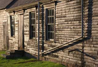
One of the first things that I notice about Gary’s images is where he stands in relationship to his subject. In these two images of the Olson/Wyeth House in Cushing, Maine, one is looking straight on at the house and the other has been taken from an angle. Both are very good images, but there is a choice here and the choice is what Gary wants you to see.
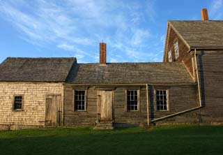
With the image that is straight on, there is a beautiful division of sky, building and foreground. The emphasis is on how the building fits into the environment. With the angled view, the emphasis is on the structure of the building? The back door, the windows and the drain pipes. Is either one right or wrong? No. It is just the perspective that you wish to show your viewer.
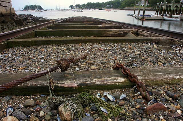
This is certainly one of my favorite of Gary’s images. By getting very close to the ground with strong lines leading toward the distant background, he is making a clear and definite statement about depth in this image.
There is no way you can stop your eye from moving down those tracks! Extremely sharp focus from one foot to infinity was selected by choosing a small aperture and maximizing the depth of field.
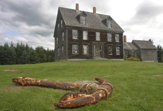
By placing the house above the center of the page, it seems to soar … become bigger than life.
Another feature that seems to make the house sit even higher on the hill and much farther away is the rusty anchor that dominates the grass space. Including an object in the foreground and using a wide-angle lens (with a small aperture to get the maximum depth of field) to emphasize that object is a wonderful technique for creating the illusion of space.
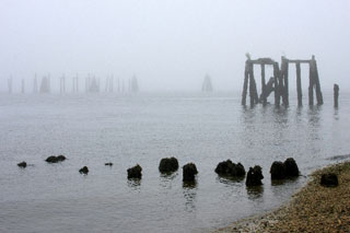
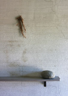
This is a wonderful example of lines by implication. If you look at the small stumps of old pilings in the foreground, it is easy to see a line. But the implied line is from the left side of the image at the end of those pilings to the right side where the mid-tone wood structure is.
The eye can easily make that jump. There is also another implied line to the very soft toned background formations and your eye makes that jump as well. The distance or depth illusion in this image is quite far although it is subtle. A nice fog bank contributes to the sense of depth.
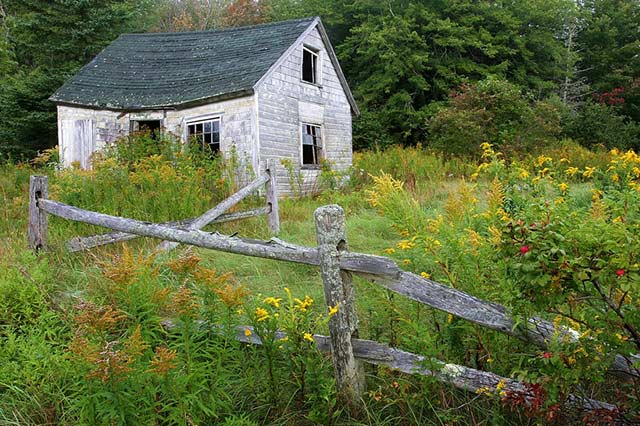
The placement of this house is off center and above the mid-point of the image space. Here we have a wonderful fence leading us back to the subject. The white walls among the green grass, roof and trees grab our attention and don’t let us go.
Your eye is drawn to the point where the lightest light meets the darkest dark. The fence creates an illusion of space from the foreground to the background in the same way the rusty anchor did. Again, Gary’s choice was a wide angle lens and a small aperture for his photography composition .
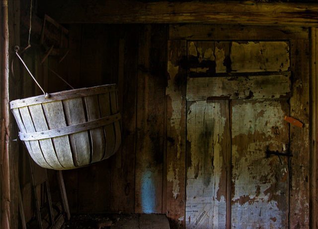
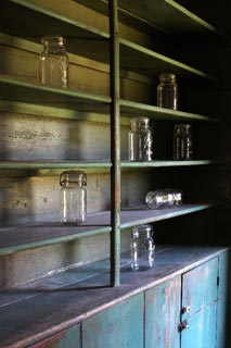
One of Gary’s very strong points as a photographer is his ability to take away all of the details in the image until he is left with a simple, distilled idea. In this image, the strong light on the bushel basket grabs our attention first. Then we look to the door and its lines.
The darkness of the overall image makes the bushel basket stand out but the soft light on the door contributes to making the bushel basket the main subject. It is a complex photograph done with a very simple technique and single idea. Gary was inspired by a Wyeth painting of this same view.
I hope you will take the time to really look and study these images and those of many other photographers, along with your own. The more you see and study images, whether it be photographs or paintings and drawings, the more you will learn about photography composition and what to include and what to exclude as you plan your photo compositions.
by Noella Ballenger
All text: © Noella Ballenger. All Rights Reserved.
All photos: © Gary Anthes. All Rights Reserved.
Not much actual blue sky in these photos, with one exception. That bears noting. Don’t be afraid to take your camera out on a gloomy day, people!