
“If you ever doubt the power of color, dye all the food on your plate blue. Then try to eat all of it.”
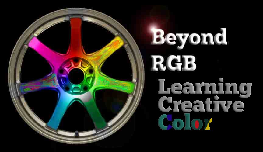
CLICKING WITH CREATIVE COLOR
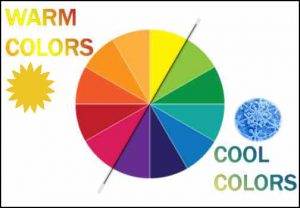
We all have color preferences. Some like hot color, and some of us like cooler colors. We change our clothing color, our preferences, and our favorites as time goes by. Digital photography has gifted us with tools to capture almost any color.
Beyond this, an awareness of effective color schemes helps to command our viewers to look. Viewers not only look at photographs with good contrast, they look for intriguing and subtle color relationships. How a color interacts with another color can make or break a photograph, but getting better color is not about just about improving saturation. Learning to see color creatively and mastering control over helps us to evoke emotion. Today, selecting, adjusting and enhancing color is an essential part of our photographic vision.
To improve our awareness, let’s investigate two schemes here in Part One of a two-part article. We’ll also explore combinations of hues with different relative positions on the color wheel.
Our goal: Improving our awareness of color schemes, so we can get more precise when we click, select, and enhance the images that we enjoy, even if they move beyond reality. First, we’ll learn about two basic color schemes.
ONE…TWO…ADDITIVE &. SUBTRACTIVE COLOR
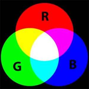
Additive and subtractive color schemes are simply ways to think about color relationships. They are mental toolsets that photographers and painters can ponder for creating vivid artwork.
THE ADDITIVE COLOR SCHEME (RGB) As photographers, we know that light is made up of visible colors. In the additive color scheme, light has three primary colors of red, green and blue. Within this color scheme there are additive secondary and tertiary colors which are combinations of the primary and secondary colors. For being more creative with color, we must not overlook another important color scheme, used by printers and painters.
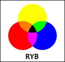
SUBTRACTIVE COLOR: PAINTERS & PRINTERS:
There is another color scheme. Painters have used subtractive color theory for centuries for mixing their oils and watercolors. It’s primary colors are Yellow, Red and Blue. Violet, orange and green are the secondary colors in this painterly scheme. Just like the additive scheme, we can mix the primary and secondary colors. For instance, mixing yellow (a primary) with orange ( a secondary) gives a tertiary hue of yellow-orange (a subtractive tertiary color).
As a photographer who prints, you may have a newer photo printer in your home studio with a subtractive CMYK color scheme, such as an Epson Stylus Photo 1400. Most custom photo labs use the same Cyan, Magenta, Yellow and Black scheme for their printing inks.
Remember, RYB and CMYK are subtractive color schemes.. RGB is an additive color scheme.
Hue, value and intensity are properties of color.
DESCRIBING COLOR: Hue, Intensity and Value
Imagine you are photographing a red candle in a dark room. It has properties of color. The candle has a red color or hue. The candle wax changes in intensity as it gets closer to the flame. The flame itself has the brightest value. We say it has greater luminance. Hue, intensity and value are all properties of color.
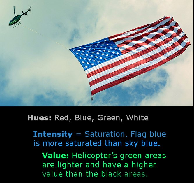
HUE is mostly the same as what we think of as a color. In the flag photograph above, the PRIMARY hues are blue, red and green.
INTENSITY is a term used interchangeably with Saturation (as in Adobe Photoshop). Emerald green, for instance, has a greater intensity than pastel green, as seen if you slide Photoshop’s saturation slider to the right.
VALUE is the relative lightness or darkness of a color. Value, for painters and photographers, refers to a color’s lightness or darkness. Black and White photographers sometimes refer to value as tone or tonality which describes a print’s range of luminance in a greyscale image.
FROM NEWTON TO NOW, or WHAT COLOR IS INDIGO ?
Isaac Newton experimented with light and discovered it was a spectrum with 11 colors he could see. Then, he trimmed them down to just 7. In addition to red, orange, yellow, blue, green and violet, Newton added indigo to his color wheel.
Even though indigo is not a color most people can identify, Newton added indigo so the number of colors, seven, would be governed by the same ratios as in a diatonic musical scale. There are 7 notes in a scale. Newton was fascinated by the idea of musical harmony in the cosmos. Our names for colors are highly subjective and have changed over time. The color Newton called Blue is what we now call Cyan.
In primary school, we learn the primary colors. We memorize the acronym for the color spectrum: ROY G. BIV
Beyond these primary hues, our awareness of the subtle hues like indigo can improve our compositions. While we photographers tend to include red hues in order to draw attention to our work, by including more sophisticated color schemes in our images, we make them more striking. Let’s consider just a few of these combinations.

COMPLIMENTARY COLOR
Photographing with complimentary color in mind adds vibrant emotion to your photographs. Red (at twelve o’Clock) and green ( six o’Clock) compliment each other.*
Clearly, there are hues other than the primary and secondary colors. These are tertiary colors; they combine a primary and secondary pair. Take red, a primary hue. Add orange, called a secondary color. Mix the two and you’ll get a Red-Orange tertiary color. Other common tertiary blends include Yellow-Green and Blue-Violet.
ADVANCED COLOR IDEAS FOR PHOTOGRAPHERS: Are you with me? Great! Here is where it gets more fun for photography. Let’s put more color schemes to work in our photographs, using the color wheel as a foundation.
A. COMPLIMENTARY: Two Colors on opposite sides of the color wheel.
B. HARMONIOUS / ANALOGOUS. These are colors next to each other (shown above at five, six and seven o’Clock.
C. TRIANGULAR TRIAD, Three Distant Colors: While red, green and blue is a common three color scheme, a more interesting combination for photography are 3 colors that are more distant on the color wheel. The Triad scheme above has Purple (ten o’Clock) which is distant from the Gold hue (two o’Clock), and both hues are equally distant from Green (at six o’Clock.)
D. RECTANGULAR TETRAD, Four Distant Colors. A tetrad is any four colors that are equidistant on the color wheel. The rectangular tetrad In this example has orange (two o’Clock) green (six o’Clock) blue (eight o’Clock) and red (twelve o’Clock).
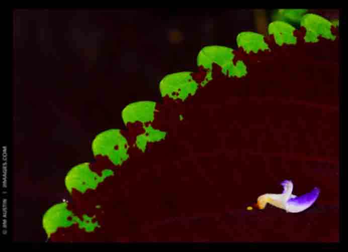
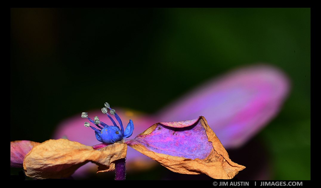
ONE: Complimentary Colors. Photographing a garden, I noticed a tiny leaf from one flower had fallen to the plant below and tried a few angles for this macro image. It has two main complimentary colors: green and a violet~ purple hue. Let’s look at the second color idea, analogous color.
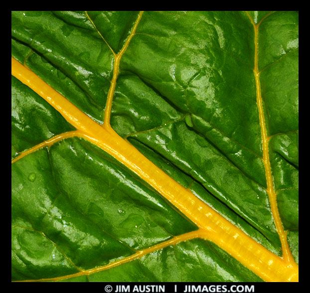
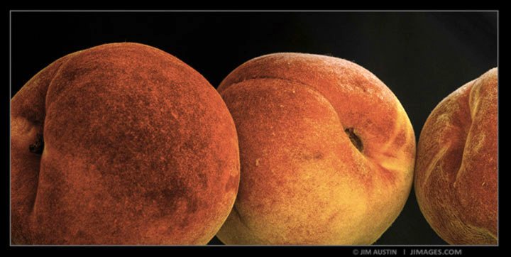
Two: Search out Analogous/Harmonious Colors. Harmonious or analogous colors are colors close to each other on the color wheel. They work well together. A close up of a chard plant shows harmonious greens and yellows, above. Likewise, red and orange are the analogous colors in this still life of peaches, below.
JUST LIKE COLOR IN PHOTOSHOP. In Photoshop, there are gradients that have sets of harmonious colors. They are in the Gradient Editor, and you can load Color Harmonies 1 and Color Harmonies 2. Photoshop uses Saturation for intensity, Hue for hue, and Brightness for value. You can measure any color in Photoshop simply by clicking the foreground color square to bring up the color picket. We will explore this more in Part 2 of Beyond RGB. For now, an awareness of how to describe the properties of color is our goal. For instance, think about the Intensity (Saturation) of the color in the image above.
The yellow hues of the chard plant image are more intense that the yellow in the peaches. For Value (Photoshop’s Brightness), the chard plant green has a higher value than the red hues in the peach picture. Relatively, it’s green is brighter than the peaches’ red. This is an important concept for photographers when converting color to black and white, as we must consider the relative values of the tones in an image.
In Photoshop, color images can be composed of stacked color channels. While RGB images are made up of three independent channels for red, green and blue, a CMYK image has four channels for cyan, magenta, yellow and black. C,M,Y and K channels can be printed in ink, a subtractiVe color scheme.
Let’s probe some other combinations, called Triad (3 equidistant hues) and Tetrad (4 equidistant hues) schemes with either three or four colors that take a place equidistantly far apart from each other on a color wheel.
THREE Discover Triad (3 Color ) Schemes. Buildings in Lunenburg, Nova Scotia are painted red to make them visible in fog. I kept the original building and dory colors of red and yellow. In post, with a Triad color scheme in mind, some colors were de-saturated and the original green touches were de-saturated or shifted to blue. The dominant 3-color triad scheme in the final image are the hues of red, yellow and blue.
FOUR Tetrad (4 Color) Arrangements. We can learn more subtle color combinations to improve our images. For instance, on the color wheel, a Tetrad has four main hues. These colors are equidistant from each other on the color wheel. For a macro image of a flower (above) Blue, Violet, Brown and a hint of green form the Tetrad. This Bahamas seascape also has a Tetrad color scheme. Its 4 main colors are shades and tints of Blue~Purple, Blue, Green and Gold.

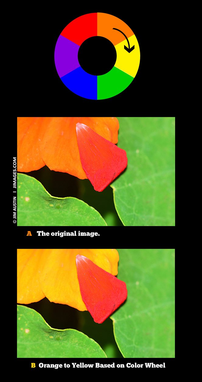
MAKING COLOR MORE STRIKING
To make the photo above more interesting, I changed the orange petal to a yellow shade in Photoshop. While red, green and orange were the main Triad of hues, I thought about making the red stand out more. On the color wheel, since orange and red are close to each other, I wanted to improve color contrast by changing the orange hue to more distant hue. Green and blue were not options. Instead, I selected the orange leaf with a selection tool and then changed the orange to a warmer hue of yellow. This orange to yellow color change let the red in the petal become more piquant.
This technique could also have been done, without selection, using Lightroom’s Hue setting to move the red slider.
COLOR WHEEL AS A GUIDE TO CREATIVE COLOR SHIFTS.
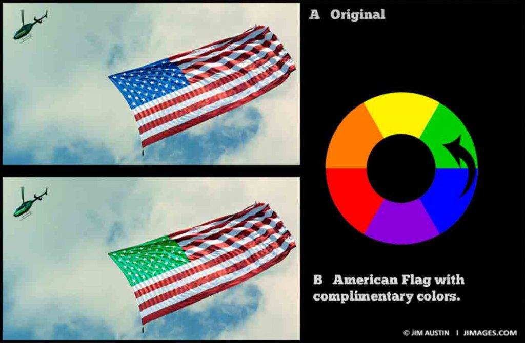
For this shot of a Manhattan chopper towing a US flag, to make the color more striking I changed one of the complimentary hues (blue) to a different hue (green) that is also a complimentary hue to red. Red and green are at opposite (complimentary) positions on the color wheel. Here, the green advances more than the blue, and matches the green of the helicopter that is towing the flag over New York Harbor.
In Beyond RGB Learning Creative Color Part 2, we will unlock keys to learning creative color, investigate the answer to the question ” What color is a red brick in a totally darkened room?” and more.
*(This is vastly simplifying complimentary colors here: Color perception is more involved. Red and green are opponent colors. Opponent color theory of perception comes in here. Stare at the red for forty seconds. Then look at a white space. Often you’ll perceive the same shape in green on the white area. This afterimage is perceptual, explained by the opponent theory involving signals from the cones in your eye processed in your brains visual systems. Cameras do not see afterimages, only brain’s visual processing does. More on this topic in Part 2).
© Jim Austin


Excellent article, thought provoking and well worth the time to review/study. Thank you Jim Austin.
Thanks Gloria, hope your photography and vision are joyful!
Gloria, thanks for making the time to comment, glad you enjoyed the article on Learning Creative Color. How is your color photographing going this summer 2017?