
Color is joy. One does not think joy. One is carried by it.” ~ Ernst Haas
On Instagram, there is a cosmos of color photos from over 100 million followers. Using its mobile or desktop app, Instagrammers can see color photographs from celebrated photographers like Stephen Shore and Steve McCurry.
Here, we’ll explore the use of primary, structural and harmonious colors in photography, and with Instagram links to these well-known photographers, you can see how they photograph with these color strategies. Even if you are not on Instagram, these tips will help you to see color in novel ways.
I’ve learned to stretch my vision by looking at how these pros, and others, compose with color. In photography, we can use harmonious, structural, and subtle colors. Bottom Line? We structure and sculpture color with our own individual vision and personality.
Personal Color
No one can tell you how to use color. This comes from your own personal color vision. There are a few aspects of seeing color, however, that we all share.
The surface light that we capture in our pictures is infused with color hues. Clearly, color is in the world outside our eyes, and perhaps less noticeably, it is within us. We see color from ther outside world with our eyes, and our brains also project color to our eyes from our visual/perceptual/emotional systems.
Color is both purely personal and highly objective. We can measure color objectively and physiologically. For those of us on social media, color is a joy. Here are a few ways to think about color, with Instagram links to a few color visionaries.
Primary Color
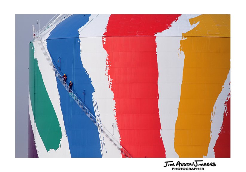
In primary school, we learned that red, green and blue were our first primary colors, and they were primary because they were the first colors. By mixing these three colors, all the colors in the spectrum are created.
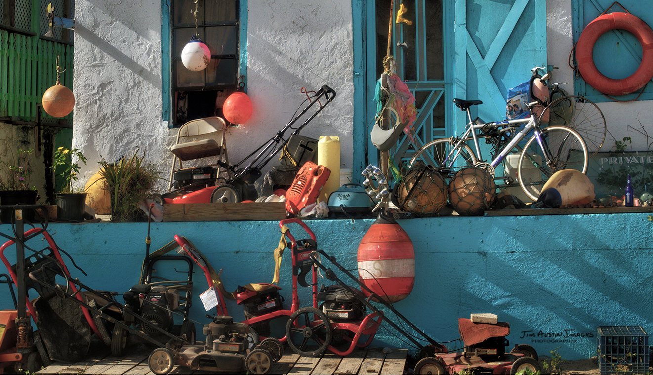
A photographic approach to primary color, that I often use, is a large swath of a single primary color. Color is a structural element in the photographic process. Composition is still the key, and my images are not “about” color, so I try to stay away from two main mistakes with primary color. They are 1) using a cacophony of color and over-saturating, and 2) out of balance color or under-saturated morose color.
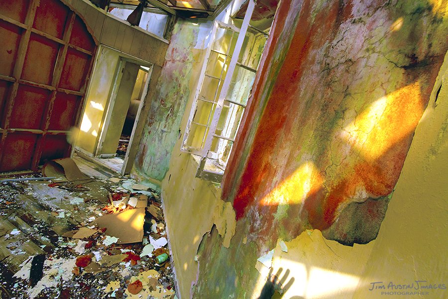
Harmonious (Complimentary) Color
Also called complimentary colors, these colors are at opposite sides on the color wheel: red and green, orange and blue, for example. When photographed with an awareness their emotional impact, color pairs have powerful symbolic impact on our feelings.
Think of capturing the symbols of the Christmas season in red and green. Watch a sunrise over the sea as an orange sun floats upward, and the blue ocean hues gradually change. Color is an emotional experience.
Harmonious colors are also favored by pro photographers who use them in iconic images. For instance, we see this in works by Steve McCurry, such as “Afghan Girl” with its reddish-greenish hues, or “Red Boy, Bombay India 1996” ( on Instagram as stevemccurryofficial with over 700 posts).
McCurry often wields complimentary red-blue combinations in his portrait work, as well as high contrast pairs like orange-yellow and orange-blue. His portrait of Shaolin Kung Fu monks (97,000 likes) hanging upside down is a personal favorite of mine with its orange and blue color harmonies.

Structural Color
Structural color is about how the deep space in a photograph relates to the frame and its edges. Color is a two dimensional, physical aspect of a composition. Photographing in color, we take the three dimensional mess of the world’s color, and then frame and expressing it with a powerful idea into a coherent, two dimensional composition.
Structural color takes effort to comprehend. The reward is a better understanding of how the elements of a scene can be changed into a compelling work of photography. One photography with a deep understanding is Stephen Shore.
On Instagram, Shore shares posts during his daily dog walks. His themes include the everyday, the vernacular, and what is close at hand. Shore’s work helps us see and understand structural color with a long lasting understanding of the photographic process. The opening date of his current MoMA exhibit, titled “All the Meat You can Eat” is November 19, 2017. (Over 1100 posts on Instagram as stephen.shore )
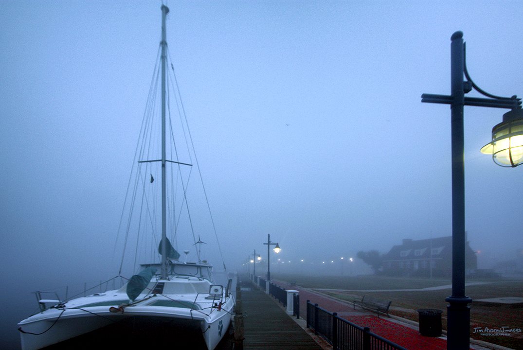
Subtle Color
Rather than describe subtle color, check out how British writer, artist and curator David Campany uses subtle color in his photographs (Over 1000 posts on Instagram as davidcampany). His understated use of color places the emphasis on lighting, a sense of mystery, and street scenes he captures in his travels.
Understated color is alluring. Photographers who understand it use color in a sophisticated way, putting the story first. One example is the 41 year old photographer from Gothenburg, Swedish photographer Asa Sjostrom (on Instagram with almost 700 posts as asjostromphotography).
Her photography has a coherent theme of the lives and issues of women and children. “Born in the Borderlands,” her series about Europe’s poorest country, shows Sjostrom’s subtle color vision behind her compassion and interest in these issues, and from the ways she portrays humanity (http://www.asasjostrom.com/#/new-page-1). She has won World Press Photo awards twice.
ABOUT JIM AUSTIN: On Instagram, Austin is jimagesphoto.
Jim is a member of the Society for Photography Education, has taught photography for over 3 decades, and is a founder of the Slow Photography Movement. His exhibits include the Denver Art Museum, Photographer’s Gallery, and work in the Smithsonian’s Natural History Museum. Find his books and photography at www.jimages.com
LINKS:
*See the Ernst Haas Estate site at http://ernst-haas.com
**Tips on Creative Color are in Jim Austin’s Photo Coach series. For good ways to use dominant colors, color combinations, and subtle color, see his article on Apogee here.

Leave a Reply