
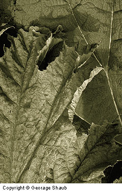
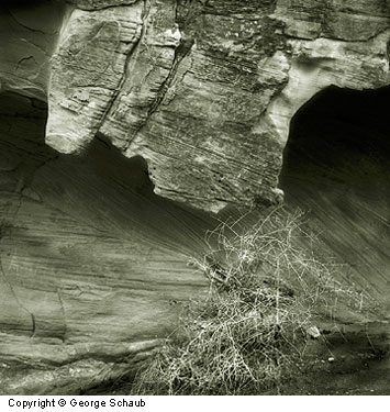
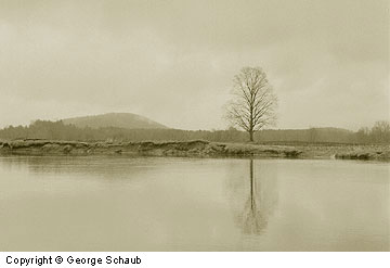
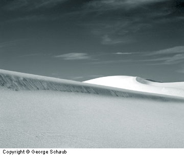
 Black-and-white has always been a bit of a misnomer when applied to monochrome prints. Most photographic printers choose their paper and developer based on the color they impart to the image. There are warm-tone papers and developers for a brown/black look and cold-tone papers and developers for more of a blue/black or neutral rendition. After-development chemical treatments, called toners, are also used for more emphatic image color, ranging from the golden/amber glow of sepia to the slightly magenta cast gained from using selenium toners. Although modernist printers emphasize a neutral, almost newspaper rendition for their images, the legacy of image color on monochrome prints is rich and varied.
By working with various ink mixes that can be attained by using the Duotone dialog box in Adobe Photoshop and similar image manipulation software, the digital print maker can attain virtually any image color he or she desires. The beauty of these programs is that the artist can preview results on the screen prior to printing, rather than awaiting the results that come from running a photographic print through chemical baths. Predictability and variability are the watchwords, all of which to leads to expanded creative freedom.
 There are a number of routes that can be followed to work in this realm. They begin with making a good scan of the image, one that yields as wide a dynamic range as possible to incorporate the tonal values available on the negative or slide. If the original is in color or if the scan is made in RGB, conversion to black-and-white is easily done by using the Image>Mode>Grayscale route in Photoshop. Another option is to use the Channel Mixer in the Image menu and to check the monochrome box. The red, green and blue sliders can be manipulated to attain precisely the tonal scale desired.
Some printers might stop right there, thinking that Grayscale is the proper mode to use for monochrome prints. This mode, however, utilizes only black ink. Although this might work for some images and end uses, an additional step can add more depth and richness to a printed image. That step is to again go to Image>Mode and convert the image to Duotone mode. (Note that in Photoshop you can get to Duotone mode only via Grayscale; you cannot convert directly from an RGB or other color space.)
Once you enter the Duotone mode, a dialog box appears. The pull-down menu offers an option of working in Duotone, Tritone, or Quadtone–or two inks, three inks or four inks, respectively. This is where you can mix inks to create a unique image color. Be sure to check the Preview box to see the results of your selection on the screen.
 Leaving black as the first ink, you can select colors by clicking on the ink box in the dialog box. The Color Picker appears. You then click on the color and shade you like. Use the Custom Picker to see the range of colors available. Here you can choose a select hue or even shades of gray.For example, you can choose a warm brown/yellow to emulate a sepia tone look or a warm shade of gray for enhanced tonal depth without too much colorization. By choosing Tritone or Quadtone, you can mix three or four inks for the image, with each option yielding a wide range of effects. You can save and name the sets for editions or portfolios in which you want to maintain a consistent color look. You can also choose from the numerous Presets (pre-mixed color combinations) offered in the Photoshop program.
While this technique offers more variations than you can possibly use, there’s another option in the Duotone dialog box that makes even more possibilities—changing the “curve” of the various colors. Click on the Curve box next to the ink color, and a classic grid/curve dialog box will appear. You can move the curve to change the ink distribution throughout the highlights, mid-tones and shadow areas of the image. As you change the shape of the curve, the image color and tonal values change accordingly. It’s a good idea to have different curve shapes for each ink, as this helps blend the inks throughout the various tonal values. You might keep the black ink curve at a straight line forty-five degrees, bow the curve in for the second ink and out for the third, for example. Another tip is to pick inks that go from darker (black) to lighter as you go down the ink selections in the dialog box.
 The preceding procedure will result in as many image color rendition options as you can imagine. Experiment with black plus color ink and black plus shades of gray. As you work, you’ll see which color combinations go with each image and paper selection.
Once you’ve made your selection and proofed the preview to your satisfaction, it’s time to print. When you print, choose the color printing mode; choosing the grayscale mode will void your color selections. And be sure to properly identify the paper surface and weight you’re printing on.This can affect your results as much as your ink selections.
Photoshop offers many ways to add image color to monochrome prints. Another is to scan and maintain the image in a color mode and then to go to Image>Adjust>Desaturate. This “keeps” the image in a color space but displays it as a grayscale image. You can then go to Image>Adjust>Variations and add subtle color touches that emulate various toning effects. Or you can go to Image>Adjust>Hue/Saturation and do the same. Keep in mind that all of these routes require that the final print be made using the color-printing mode.
The same techniques can be used whether you use dye or pigment inks. Both result in rich and vibrant prints that can emulate old processes and chemical toning techniques or deliver full-scale “modern” prints that have a dazzling, enhanced tonal scale. Add all this to the vast arsenal or image manipulation tools in Photoshop, and you have an extremely powerful creative kit at your disposal. Once you explore the potential, you’ll discover that the possibilities are endless.
by George Schaub
Leave a Reply