
Are there rules for design? This is the fourth article in a series. In this one we look at the Gestalt theory, which was a school of thought developed early this century by German and Austrian psychologists, and known as Gestalt – a German word meaning “shape.”
It was their goal to learn how the mind perceived and processed visual input based upon pattern seeking.
The result was a theory of principles, supposedly free from subjective aesthetic bias, that artists have been able to use to present visual information – whether it be the printed page, painting or photography. This theory is called “Gestalt Theory” and although it may use unfamiliar names or titles, these principles may be familiar to most photographers.
Gestalt is not design, but knowing the visual principles of Gestalt and their corollaries will give you a valuable design toolbox.
When composing your photograph, remember your prime objective is to control the viewer’s eyes. You can use the concept of “continuation” to do this. Continuation is the eye’s instinctive tendency to follow a path. This path can be real, as in the picture below, or imagined, as when we “connect the dots” in the children’s game or identify constellations in the evening sky.
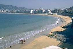
Let’s consider the beach scene. What’s most striking about this photo is the wide sweep of the beach, highlighted by the surf which provides an additional area of brightness our eyes want to follow. Many of us will enter the picture at the bottom, because the bottom is closest to us.
From there, our eyes sweep upward through the image. In doing so, we’re led through the picture and encouraged to see the people walking on the beach, as well as the town in the background. This picture makes good use of a curve to help us notice the elements the photographer wants us to see–to achieve the effect he wants.
In this case, we can’t help thinking, “What a nice place to vacation!”
While beaches are intriguing, a more common “lead-in line” can be a country road which leads us into a beautiful pastoral scene or, often, into magnificent fall foliage.
If a person is included, it serves as an additional splash of color while providing scale for the image as well as human interest. The road technique is simple to use and produces a very effective composition. Other common lead-in lines are rivers, fences, railroads and steps.
Each of these can be used as a compositional element which helps to emphasize other more important elements. They do so because they provide a path for the viewer’s eye to take into and/or through the image.
Gestalt Theory In Portraiture
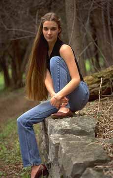
So far, we’ve discussed continuity in terms of nature and landscapes. How might it be used in portraiture? Look at the following two portraits. Each uses different forms of lead-in lines to draw the viewer to the subject and her face. Can you pick out the lines?
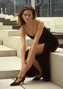
I cropped the difference off of the top only. Not only were the windows distracting because of the reflections in them, but the additional space above the model’s head upset the balance of positive and negative space, thereby greatly weakening the composition. Remember an off-balance of negative and positive space has a particular meaning in a composition.
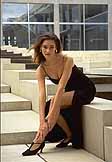
In the photo on the right, the model is placed in an architectural environment which is full of repeating patterns, most notably the steps. The steps form a strong diagonal which draws attention up (or down) through the photograph, with the model breaking up the sweep.
We instinctively follow the lines of the steps, and in every case, we’re led to the model. The photographer has done something extra in this case. For him, it’s not enough to merely draw attention to the model. He wants the viewer to notice her face.
Dressing her in black served to emphasize her arms and legs, and by posing her arms and legs in this manner – even though it is a bit contrived – the photographer created very strong lines to follow up to her shoulder and head.
The picture on the left presents a similar situation in a more natural setting. What are the lines in this image which draw our eyes? First, we see the rock fence. Although we don’t see the fence go beyond the model, the log behind her is sufficiently in focus to convince our eyes to accept it as a continuation of the fence.
In other words, we’re led into the photo by the rock fence, and the log provides a similar enough form to persuade our eyes to complete the sweep through the scene.
In the middle of the sweep is our model. Notice how the photographer used her pose to further attract our eyes. The model’s legs, made similar because of the denim color, present an interesting zig-zag path up to her head and face. If we choose to follow the fence, however, we run into her foot and arms.
As they are a contrasting color from the fence and her legs, they supply another interesting path to the face. The intertwining of the three “lead-ins “–the fence, the legs, and the arms–makes this a very enjoyable picture.
How can you use continuation to help your photos? Pay attention to naturally occurring elements in the scene which attract your eyes. Use your view finder to note how the lines of these elements intersect the edges of your view finder and might provide a path into or through your photo.
If you’re shooting a landscape, make sure the path leads your eye to the scenic elements which are most important or interesting. The line should be a prominent part of the composition, but remember, it’s a device to help your viewer find the feature you really want to emphasize.
In portraiture, place your subject so that the lines lead to him/ her. Strengthen your composition by using the model’s pose and clothing to create additional lines to pull the viewer’s eyes to the subject’s head and face. Best of all, enjoy the creative power of continuation.
Our next article will be: Figure/Ground.
Except where noted, all photos copyrighted, Corel Corporation. All Rights Reserved. These photos are only for viewing purposes in this article and may not be downloaded for any other purpose.
You’ll want to read all of the other articles in the series:
Part 1 – Gestalt Theory and Photographic Composition: Equilibrium
Part 2 – Gestalt Theory and Photographic Composition: Closure
Part 3 – Gestalt Theory and Photographic Composition: Proximity
Part 5 – Gestalt Theory and Photographic Composition: Figure/Ground
Part 6 – Gestalt Theory and Photographic Composition: Isomorphic Correspondence
by Michael Fulks
Leave a Reply