
What makes an image of two children stand out, even if they are not your kids?
Look in most people’s online portfolios, in scrapbooks or photo albums, or maybe even on your Aunt Edna’s refrigerator door, and you’ll see them–those undesirable snapshots of two or more people. You know the ones. Maybe they’re of your sister and brother-in-law in Maui or your brother’s two kids. Maybe they’re of you and your spouse taken by a well-meaning passerby during your last vacation. The reason people keep these snapshots is they have special emotional appeal to the person displaying them.
This sentimental phenomenon is called “isomorphic correspondence,” a psychological term that describes our attractions to things based upon subconscious emotional reactions. For example, almost everyone reacts emotionally to photos of babies, whether human or animal, regardless of whether the image itself is good or not. It’s also why sex sells and the picture of your baby is better than anyone else’s. Take away the object that “hooks” our subconscious drives, and the photo often becomes meaningless or simply unappealing.
So what makes an image transcend being a mere snapshot to become an image that can stand on its own merit? How is an image created that will appeal to a variety of viewers, not because of emotional reactions to the subject, but because the image communicates to the viewer in a more universal way? In other words, it’s not a good image simply because it’s of your daughter. It’s an image that has an appeal to a wider audience as a result of something special about the image itself.
The “2’fer” Assignment
The “2’fer” assignment is a first step towards understanding what distinguishes a good photograph from a mere snapshot. Students in my beginning photography classes find out how easily and quickly anyone can begin to improve their photography through the study of good 2’fers and the principles behind what makes one good.
How do you begin?
First, go through magazines and cut out all the pictures you can find that feature a couple of people as the subject. Be generous; make your sample a large one by cutting out enough images to enable you to start to see patterns emerging. (This may be as few as 20 or as many as 50.)
Next, arrange them into two groups: one for those that really grab you, and another for those you don’t like.
Look at the losers first. What do these pictures have in common? Most images that are static, dull and meaningless have one or more of the following problems:

Is this a snapshot of a couple or of a place? Does this image tell us anything about the couple pictured here or is more about the location?
Bull’s Eye Composition
It’s common for beginning photographers to place the subject right in the middle of the image. Perhaps the failure of the resultant image is due to the way the camera focuses or the fact that the photographer is so focused on the subject that he forgets about everything else. This is not to say that all bull’s eye compositions never work. They occasionally do, but usually only for certain situations and subjects.
Equidistant Spatial Arrangement
Are the subjects equidistant from the camera? Often when this is the case, the heads are the same size or occupy exactly the same amount of space within the image, creating a static, boring composition. Again, is this arrangement always wrong? Not necessarily.
Horizontal Alignment
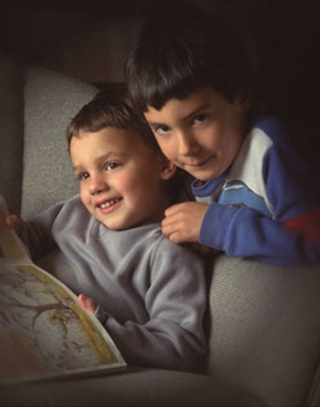
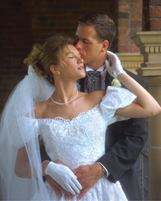
Do the heads form a straight horizontal line going through the image? This often has the same result as the previously mentioned problem; it creates a static, boring composition. This hazard is the reason many good photographers take care to arrange the people so their head positions break up the line. A pyramid is a common arrangement for avoiding the problem when you’re working with a group.
Inappropriate Negative Space
Unless there’s a conscious decision to do otherwise, the artist or photographer will often seek to find a balance between the negative and positive space of an image. Often the result of bull’s eye arrangements is that it leaves too much headroom (in this case, negative space) that then competes with the subject for attention. Also, the use of negative space can have emotional and psychological consequences. Too much negative space sends a message that is usually not what was intended.
Distracting Backgrounds
Closely related to the previous problem, if you’re not paying attention to the negative space of your image as you take it, you probably won’t notice the background. A distracting background has elements in it that draw our eyes away from the intended subject. It can be clutter, shrubbery, or a number of other “noisy” situations. Also, by not paying attention to the negative space and thus the background, you can create the unfortunate situation of having a branch behind the subject appear to be growing out of her head. This mistake is caused by your reaction to the elements of the image and the tendency of the brain when looking at a two dimensional picture to see objects that are close together and in focus as being a single object. This tendency is the result of the “rule of proximity” – the closeness of objects which can become part of the positive space.
What messages does this picture send to the viewer?
Now, let’s look at the pile of “winning” images. Images that hook us and continue to demand our attention usually have one thing in common: the composition. Composition refers to the way the image is laid out. Good composition actively engages both our minds and our eyes. This can be done several ways:
First, there’s often an interesting interaction between the negative and positive spaces of the image – the positive space is the space occupied by your subject. Conversely, negative space is the space that is not your subject.
Next, a dynamic photo often makes use of closure – provides gateways in and out of the image.
Sometimes, the image may make use of lines that draw you through the picture. This is called continuation – the concept of “Lines of Sight” as an aid to composition. There may also be a repetition of shapes, textures, or colors that creates cohesion by forcing the eye to move through the picture as over stepping-stones in a stream. All of these techniques grab us, because they actively engage our minds.
Also, they counteract our natural tendency towards symmetry and equilibrium – creating balance within the image frame or what you convey by apparently arbitrary positioning of the subject here or there, and to use such positioning to effectively communicate your meaning.
There may also be an intentional use of isomorphic correspondence – we respond to meaning. When we see an image such as a painting or a photo, we interpret its meaning based upon our experiences and memories. Photojournalistic images can do this. Advertisements that use half naked people to sell beer or cars are also doing this. It is my opinion that a picture needs more than isomorphic correspondence to hold together. Usually, the correspondence is used in combination with other techniques we’ve already mentioned. Finally, especially when you’re photographing couples, you’ll usually detect a physical connection between the subjects or some sort of ongoing communication.
Now, it should be easier for you to flip through a magazine and understand why some images catch your eye and some don’t. Art designers and photographers work together to create images on the page that intentionally use these techniques. Because their images are in competition with hundreds of others in any given publication, it is essential that their images catch you and makes you stop to see what they are all about. I call this the “two-second rule.” If an image causes me to stop flipping pages and can hold my attention for at least two seconds, I consider it a successful image.
Try to keep these principles in mind when you’re creating any picture. You’ll find your images quickly improving and earning the approval of more people (not just Mom!).
by Michael Fulks
Article and photos: © 2014 Michael Fulks. All rights reserved.
Leave a Reply