
This is the second article in our new series called IMAGE TALK. It is our hope that by reviewing and talking about what’s right with an image, we will inspire our readers to continue to improve and grow in this art form called photography.
In this IMAGE TALK, I have chosen three images submitted by my online class students. While different in subject matter, each illustrates the use of strong compositional elements.

© 2011 Cindy Garwood. All rights reserved.
Nikon D300, 70mm, ISO 400
F/11 @ 1/125 sec, tripod
OLD BROOM by Cindy Garwood
Subject:
There are four simple components to this composition….a window, a wall, a sidewalk and a rather unusual broom. While the old broom is the primary subject, the other components figure prominently in the composition and support the main subject.
Conditions:
Cindy took this image while on a recent trip to Murano, Italy. It was early in the morning on a very cloudy day. Cloudy days can be wonderful because without harsh sunlight, the colors seem to pop forward and intensify.
Composition:
1. The wall has a great texture and when shot at an angle, the composite of brick and mortar becomes more defined.
2. By taking the wall at an angle it also became a strong diagonal in the frame of the image.
3. The smooth finish of the sidewalk contrasts to the texture of the wall, emphasizing it even more.
4. The dark window in the upper right corner is effectively placed in the frame to keep your eye from rushing through the image and leaving the composition. It blocks your exit.
5. The casual diagonal of the broom and the sweep of the bristles on the smooth sidewalk add interest as well as acting as a counterweight to the window. Therefore, the broom becomes the subject with very strong support from the other components.
Noella’s comments:
This is an image that shows how you can use just a few elements to tell a wonderful story. The construction is very simple, but that doesn’t mean that it didn’t take some careful thought. In this instance, not only is the angled shot more flattering to the image, but it adds a sense of depth. You can literally place yourself in the image, taking in the ambience of the scene.
While the window takes up a bit of space, its location in the image does not compete with the weight of the wall and it’s strong, interesting texture.
The broom in this image is the subject for several reasons. First, the broom is unlike most brooms we see, so it draws our attention. It adds to the “old world” feeling conveyed by chipped plaster, weathered wood and crumbling bricks.
Cindy did a beautiful job of portraying an “earthy, traditional” look, not just because of the composition and subject, but also because of the tonal range of muted colors.

© 2011 Suzanne Cochrane. All rights reserved.
Canon EOS Rebel T1i, 47mm, f/14 @ 1/320 sec
GLADIOLA by Suzanne Cochrane
Subject: A close-up of a fully opened gladiola blossom that certainly takes center stage.
Conditions: Suzanne was walking through a parking lot in Corte Madera, California on a bright sunny day. She saw this gladiola plant in the shade and the stalk was so heavy with blossoms that it was laying on the pavement. “I used my purse and my shoe to hold it in place so I could take the photograph!”
Composition:
1. Pedals are cropped to focus on the center of the flower.
2. Stamen and pistol are on a slight diagonal which softens the general feeling of the image.
3. By cropping in close, the detailed view of the stamen pulls the eye down into the center of the flower and urges the viewer to take a closer.
4. Soft light (no shadows) adds to the intimate feeling of the image.
Noella’s Comments:
In Suzanne’s close up shot of the gladiola, all of the intimacy and softness of this image makes the viewer want to lean in closer to catch a bit of the aroma and to perhaps stroke the soft petals.
All of the edges of the petals were cropped, but we can see that it was done with purpose. Suzanne certainly made a good cropping decision. If you are going to crop an image, whether in camera or post production, look at the subject matter carefully and make an intentional decision. Your crop should draw the viewer’s attention to the subject and enhance the overall look. Cropping should never be accidental or haphazard.
Diagonals have a special appeal to the viewer because they move your eye through the frame. By placing the flower at a slight diagonal and by using the gently curved lines of the stamen it became aesthetically pleasing.
Because the flower was in the shade, the harsh sun became muted. This softer light brings out the rich colors of the gladiola.
In this image of a gladiola blossom by Suzanne, we can see how she brought the viewer closer, captured their attention and kept them engaged in the image.
DOWN THE ROAD by Mike Denson
Subject: At first glance, one merely sees the simplicity of a beautiful tree lined road. But as one delves further into the image, one picks up on a number of complex design elements created by the three components of the image—the tree trunks, the tree blossoms and the road.
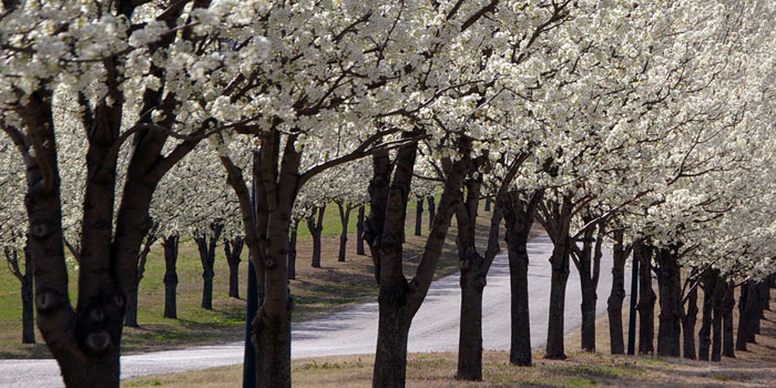
© 2008 Mike Denson. All Rights Reserved.
Pentax K100D, 93 mm, ISO 200, f/10 @ 1/500 sec
Conditions: This shot was taken in the late afternoon on a spring day in Grand Lake, Oklahoma. The sky was partly cloudy. Mike said that it had been a very wet winter with a lot of flooding, so the trees had all the moisture needed to produce an abundance of flowers.
Composition:
1. The three strong lines of the tree trunks, blossoms and road run on the diagonal. They capture your eye, pull you through the image, and then bring you back again.
2. The total convergence of flowers in the upper right-hand corner stops your eye from leaving the image.
3. The repeated patterns of the tree trunks make a rhythmical movement as they break up the blandness of the road surface.
4. The texture of the blossoms softens the repeated pattern of the tree trunks and the strong diagonal lines.
5. As you begin to look even closer at the scene, you pick up on the various shapes and forms–faint circles within the tree trunks, the many triangles of the branches, the oblongs between the trunks and the implied ovals of the flowering canopies.
Noella’s Comments:
Mike’s image shows us how lines can be used to convey movement and direction. Combine that with the three subject lines being placed on a diagonal and you get the illusion of depth, which pulls you through his image.
In addition, he found a scene that incorporates multiple design elements–line, texture, pattern, shapes and forms. In order to design a powerful image that portrays simplicity, even when it has multiple design elements, the photographer must eliminate from view everything else that doesn’t contribute to the impact of the photograph. For instance, including the sky would have had no substantial benefit.
Mike has done a masterful job of reducing and simplifying the components of the image to just three. By giving them equal weight, he created a photograph that becomes dramatic in its simplicity. One can imagine a leisurely drive with the windows down, taking in the incredible, sweet scent of those blossoms as they permeate the air.
Come back and join us for another IMAGE TALK in the near future.
To see all the IMAGE TALK… critiques, just click here.
Acknowledgments: I would like to thank Marla Meier for her editing assistance in order to present the images for this series. And, our thanks to the photographer/artists who allow us the use of their wonderful photos in these columns.
You inspire all of us!


Leave a Reply