
Let’s look at the concept of negative space photography in part 1 of this tutorial.

Over the years I have been on various board of directors for arts councils, a job which involved overseeing an art gallery. The gallery welcomed photographers and at one time 25% of the gallery was devoted to photography.
While criteria of accepting a photographer never hinged on the dreaded “yes, but it is art?” question, many photographers were dismayed when their work was not accepted. The judges, while not questioning the issue of art, did judge the work based on basic things like the photographer’s sense of composition.
They considered his use of color or Black and white , in other words did his use of color, or lack of it, add something to the body of work that distinguished him or her from other photographers. And they looked for something about the work that drew the viewer into it, captivating him visually or emotionally.
Very rarely, and only if one of the judges was a photographer, did the discussion wander into technical issues such as depth of field, corner to corner sharpness of the printing, or choice of papers.
This frustration on the part of many photographers was repeated when they entered local and regional art shows. Many were rejected without explanation. If their work was accepted, they often wondered how and why ribbons were awarded in the photography category, especially if they did not get one.
Comments I heard from photographers ranged from, “But it wasn’t even in focus!” to “What a lousy job of printing!” Clearly they were not seeing what the judges saw.
The difference between what the judges saw and what the photographers saw is often basic to the “is it art?” question. Preoccupation with technique generally characterizes a craft rather than an “art.” But while many photographers view their work as art, they often, nonetheless, judge another photographer’s work based upon his or her mastery of technique rather than artistic merit.
Art judges, not versed in the subtleties of technique, tend to judge a photograph as they do other art, looking for composition, content, and style.
Many photographers feel that they have mastered composition; after all, composition was one of the first things they learned in basic photography. But what they don’t know is that what they learned in basic photography is only the tip of the iceberg.
The average photography student probably didn’t learn what most other artists learn in their basic classes. And what artists know and you don’t, as a photographer, may be the key to producing dynamic and award winning photos.
I am speaking, of course, from an artistic point of view. It probably won’t help win you a Pulitzer prize. And it may not help you be a winner at the local camera club unless your technique is also well polished. But it may get you noticed more often in the fine art competitions, and it will make you a better photographer.

Fig. 1
According to the rule of thirds, your subject should go at a point where the lines intersect.
Let’s begin with the basics. We all learn the basic “rule of thirds” in our first photography classes. (See figure 1) This was probably the first time anyone told us to stop putting everything dead center in the picture. Shooting using the rule of thirds immediately improved our pictures.
Nonetheless you probably had someone in your life who commented that it looked like your camera slipped, and how come Aunt Edna wasn’t centered a little better. But maybe it was just your choice of subject matter.
While the rule of thirds produces pretty pictures, after a while many of those pictures start to look alike, especially if you are in a position where you have to look at a lot of photographs, like an photo editor or a judge. And because they start to look alike, we may start to look at other factors such as printing and “technique” or whether the girl in the picture should have worn more make-up or not.
What is happening here is that the photograph does not interest the eye enough by itself and so we go looking for something “tangible” by which to judge it.
So how do we keep the eye interested? Is putting something “eye-catching” in the photo the only solution? (Some people think so. Perhaps that is why so many photography competitions seem to use the unwritten rule: the prettier the girl in the picture the higher the score.
But don’t get me started on that one.) Is there something more subtle going on that controls our interest and engages the eye and creates a picture that you won’t tire of? That’s where we come on to negative space photography.
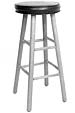
Fig.2
A Stool

Fig. 3
The positive space is masked in black

Fig. 4
The negative space is masked in black. See how the negative space exists as objects that define the stool. In fact you can draw the stool simply by drawing the negative spaces alone! getting to grips with negative space photography now?
The frame, the positive and the negative.
In many basic drawing classes students learn that there are three basic elements of a composition: the frame, the positive space and the negative space.
The positive space is easiest to understand. Generally, it is the space occupied by your subject. Conversely, negative space is the space that is not your subject. Sounds easy doesn’t it? Not quite. The negative space is defined by the edges of the positive space and the frame or border, our third element.
So, part of our negative space is bounded by the frame and another part is bounded by the positive space. Sometimes the negative space is completely bounded by the positive space. What is important also to note is that the negative space also defines our subject. Confused, look at the illustrations of the stool. (Fig. 2-4) That should make it easier to understand.
Subjectively speaking, a composition “works” when there is a balance struck between the positive and the negative. A major factor in controlling this balance is the frame or border of the picture. While the balance notion is easy to grasp, the contribution of the frame is harder to grasp and harder to teach, especially to grownups.
The frame is edge of the paper if you’re drawing. It could be the edge of the viewfinder or the camera’s LCD screen, print, negative, or slide in photography. Sounds easy, but do you know, that most adults are not aware of the edges of their view finder, or the edges of the paper.
They have to be trained to see it as part of their compositions. Art teachers of pre-adolescent youngsters tell me that those children pick up on this almost instinctively, but that it becomes more difficult to teach the older the child becomes, apparently because of how we train our minds to process information.
The older we get the less likely we are to categorize the edge of the paper as having important information or relevance to our composition.
But it does. It is what gives definition to our composition. When I was taking my fine art photography course, my instructor forbade us to crop. In teaching us to “see” he wanted to force us to pay attention to the edges of the view finder.
When we presented our pictures for critique, of course, he was there with the cropping “L’s” to take a little off here and there until suddenly the picture would “pop.”
He didn’t call it balancing negative and positive space, but I realize now that was what he was doing. His goal was to teach us to see that balance when we were shooting. He believed that that would make us more aware of what we were shooting and more selective and careful when he finally clicked the shutter.
Awareness Of Negative Space Photography
What it also did for me was to make me more aware of the effect of the background of my photograph, in other words, that which was not my subject – the negative space. Suddenly I was more aware of elements that would be distractive.
I was aware of when a branch came out of my subject’s head, because I saw how it became linked to the subject’s space and threw off the balance of the picture. This is an important realization:
The branch protruding from Aunt Edna’s head not only destroys the picture because it looks funny, but because it upsets the balance between positive and negative spaces. The branch by making contact with her head, and being in the same focal plane as her head, becomes part of the positive space, instead of the negative space as I intended.
This does not mean I do not crop, I do, but I always attempt to see and get what I want the first time rather than relying on the digital darkroom (post-processing software), the physical darkroom or my paper cutter. And you should crop too, but only if it will improve the balance and composition of the picture.
But how are you cropping? Is it square, oval, round, or rectangle? We are back to the frame again (frame meaning the physical border of the photograph.)
The very shape of the frame affects the relationship of positive and negative space. And sometimes the balance isn’t achieved by a standard format. It may be long and narrow! Have you noticed how much more beautiful a movie looks in “letter-box” format on the “silver screen” than in the more square format of a TV set.
This is the effect of the frame and the fact that the cinematographer composed the scene knowing that his frame is the long and narrow of a wide screen. When his work is cropped arbitrarily to accommodate the TV set, much of the mastery and beauty of the cinematographer’s work is lost.
Composition, the skilled use of the positive and negative spaces interacting with the edges of your work, has measurable effects on a viewer’s eye. For one thing it provides a road map for his eye to view the picture. Remember that your goal in composition is controlling your viewer’s eye. You want him to see what you want him to and not to get bored. You want him to discover things that might not be so obvious. These are aspects of photography you can also out to good use, should you decide to investigate photography tours
by Michael Fulks
All text, graphics and photos: © Michael Fulks. All Rights Reserved.
Leave a Reply