
Purpose:
The Levels Adjustment Layer is used for contrast control and color correction, both in the same layer. It’s an extremely versatile tool – if I only had one function available to me in Photoshop, this would be the one. In a well-exposed image, it’s entirely possible that with a few simple adjustments in levels, your image will be ready to print.
We’ll discuss this critical subject in two articles – Part 2 is here.
Why Adjustment Layers?
For your critical images, you should be working in Adjustment Layers. Think of Adjustment Layers as “clear plastic overlays” sandwiched over your original image, with each layer giving you the global ability to control an adjustment (such as contrast & color with Levels) to your final image. In addition to “global” control, you can define what areas to “localize” by shaping your Layer Mask (part of an adjustment layer) using Selections. I have a series of columns on Apogee Photo that dig deeply into “The Power of Layer Masks” – Click here for more information…
How to create a Levels Adjustment Layers (3 ways):
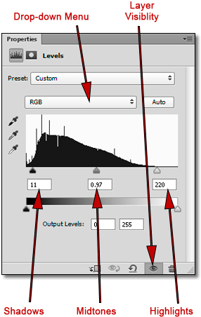
~ The easiest way to create one is to click on its icon in the Adjustments Panel. Once you create a Levels Adjustment Layer (which shows up in the Layers Panel), you’ll view it’s properties and controls in the Properties Panel.
By the way, don’t let that last sentence confuse you: these Panels are discussed in my Apogee Photo Article on “Setting up your Workspace”.
~ In addition, you can click on the “New Adjustment Layer” button (the Yin-Yang” button) in the Layers Panel, and choose Levels from the drop-down list.
~ You can also go to the “Layers” menu -> “New Adjustment Layer” and choose it from that menu.
By the way, there are two places you do NOT want to open any Adjustment Layer: The “Image” menu -> “Adjustments” and the speed keys that are shown in that menu. The reason? If you choose either one of these locations, a separate adjustment layer is not created, which defeats the whole purpose of layers.
The Histogram:
The Histogram is a graph that represents the total range of an image, as measured in pixels. It basically tells you how your image is exposed.
The higher the graph for a particular value, the more information there is at that level.
~ The left side of your histogram represents “dark” pixels, with “0” being Black.
~ The right side of your histogram represents “light” pixels, with “255” being White.
~ The middle of your histogram represents mid-tones, with 1.00 being right in the middle.
By the way, don’t let the mid-tone numerical value confuse you – it’s different because it’s technically “Gamma”, which is midtone contrast.
Generally speaking, an image that is under exposed will have more values on the left side of the graph (similar to the diagram above), an image that is over exposed will have more values on the right side of the graph, and an image that is “normally” exposed will have values evenly distributed throughout the histogram.
By the way, in my Apogee Photo articles on “RAW Fundamentals Part 1 & Part 2”, you’ll learn why you typically should be slightly under-exposing your images anyway.
Note that I said “generally speaking” in the above sentence. There are always exceptions to the rule. For example, a scene of snow may print well, but its histogram will be weighted with more “light” pixels, whereas a night scene may also print well, but its histogram will be weighted with more “dark” pixels.
In my opinion, it’s easy to place too much emphasis on what a histogram shows you. It’s important, to be sure, but you should use it as a guide, and not let it become your “gospel”. How your final image looks should be the deciding factor in what works and in what doesn’t. No one looks at a print and says, “Oh, that’s a great print, but the histogram looks terrible!”
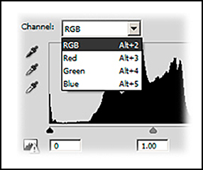
What’s with the Drop-Down Menu?
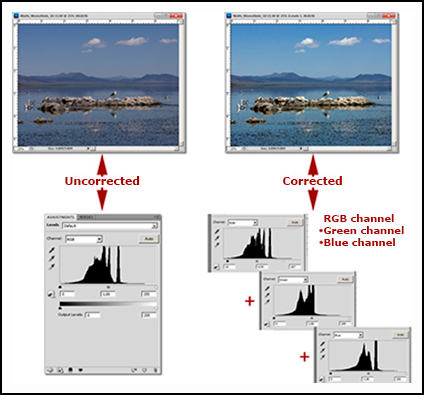
Remember, you can control both contrast and color balance in Levels, and here’s where you do it:
~ Contrast is adjusted using the default composite RGB Channel.
~ The overall Color Balance is adjusted using the individual Red, Green and Blue Channels.
Start with Contrast:
~ The definition of Contrast is the difference in brightness between the light and dark areas of an image. As our eyes generally like “snappy” (higher contrast) prints, you are trying to achieve the maximum “snap” or high contrast without blocking up shadow areas, while at the same time retaining detail in the highlight areas.
~ Adjust your overall Contrast before adjusting your overall Color. If you adjust your color first, then adjust your contrast, you’ll get unrealistic and unexpected color shifts.
In the next column (Part 2), we’ll learn how to adjust your contrast properly, how to adjust your White and Black Points, and how to globally color correct, with some “real-world” examples.
Until the next column, have fun and stay well!
Read Part 2 – White Point/Black Point, Clipping, Contrast and Color Channels
by John Watts, Watts Digital Imaging
All text & photos / screen shots: © 2013 John Watts, Watts Digital Imaging. All rights reserved.
Leave a Reply