
So, what makes a good color print, and how do you use the basics of Photoshop to achieve your desired results?
In other words, for what are you aiming?
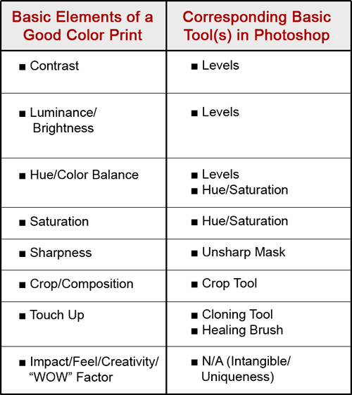
There are eight basic elements necessary in the making of a good color print, listed below, followed by the tool(s) in Photoshop to control that element. If you make proper use of these elements, then you end up with a good quality print.
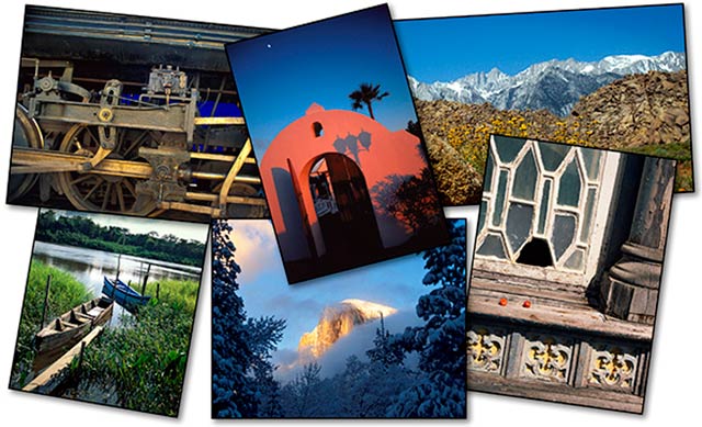
As a frequent judge at various photo contests throughout Southern California, I’ve seen fantastic images that were lacking, because they “violated” one of these elements, so let’s get you familiarized with them over the next 3 columns.
A few definitions and explanations are in order:
Contrast: Contrast is the difference in brightness between the light and dark areas of an image. A high contrast image has a harsh look, typically having a lot of dark areas and a lot of light areas and very little mid-tones. A low contrast image, by comparison, is flat, bland and lifeless — mostly mid-tones with very few dark areas and light areas.
What is color? The dictionary defines it as “the quality of an object or substance with respect to light reflected by the object, usually determined visually by measurement of hue, saturation, and brightness of the reflected light.”
So, the 3 main attributes/components of color are:Hue, Saturation, and Luminance (Brightness).
Hue: Hue is a single color cast or color name. Green is a hue, Orange is a hue, and so on.
Saturation: Saturation is the intensity, purity or amount of a hue. A pastel red is less saturated than a fire-engine red, lime green has more saturation than chiffon green, etc.
Luminance (Brightness): Luminance is the amount of perceived brightness of a color. The color black has no luminance, whereas the color white has the highest luminance.
You’ll see that we’ll be able to control all of these elements in Photoshop, with the exception of the last one – Impact/Feel/Creativity. This is up to your skill and artistic interpretation as a photographer.
I like to call this the “WOW” Factor, because as you look at a strong image with impact, you want to say, “WOW!”. It is my opinion that Photoshop, used properly, will take a good image and make it a very good image – – It will take a great image and make a “WOW” image.
So, how do you your increase your “WOW Factor” in an image – increase its uniqueness? You might find the answer from Jim Austin in What Makes Photography Unique?
Next month, in Part 2, I’ll show you practical examples of Contrast and Color in action, as well as links to some of my past Apogee Photo articles that’ll show you how to make the changes necessary to achieve your desired results.
by John Watts, Watts Digital Imaging
All text & photos / screen shots: © 2014 John Watts, Watts Digital Imaging. All rights reserved.
Leave a Reply