
I grew up in the darkroom printing black and white. The hidden mystery of developing film and making a print from what was once a latent image was nothing less than magical.
During my photo assisting years I was lucky enough to learn from a couple of unsung darkroom masters: Ken Ohara and Frank Finnochio, who both had worked for Avedon as Black & White printers. They shared those hard-earned technical skills with me and for many years I made my living as a printer as well.
Fast forward to 2016, I cross paths with Stu Maschwitz on the Adobe beta testers site. Stu is a filmmaker and effects guy with a still photography pedigree and a penchant for being a nerd. He’s worked for Industrial Light & Magic and noted for his brilliant skills as a digital master of color and black and white.
Among other things, he uses those skills to make his Prolost Bespoke Lightroom Develop plugins. Stu’s latest endeavor is the 112 Prolost Winter 2016 Lightroom Develop presets (Lightroom 4 or later), Black & White presets designed to reflect his credo, “You’ll know great black and white when you see it.”
To get a feel for these presets, I’ve chosen 4 distinctly different color images from my library. I’m starting with undeveloped camera raw captures as they came from my Nikon D810.
As a control, I’ve used Lightroom’s default Black & White conversion button in the Basic panel on each sample photo before applying the Prolost presets (you’ll get the same result when you select the B&W tab in the HSL/Color/B&W panel).
Also, I will be making a virtual copy of my test photos each time I apply a preset. And, keep in mind that presets are not an end, they’re a start. So, make the most of your Lightroom presets, add adjustments that create results that become uniquely your own.
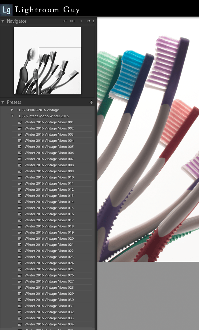
Before I get started, there’s a feature of Lightroom’s Develop module Presets panel, I want to mention. By simply hovering the cursor over any preset, a preview showing the effect will appear in the Navigator window. This is a fast way to preview without having to load the preset into the full resolution preview.
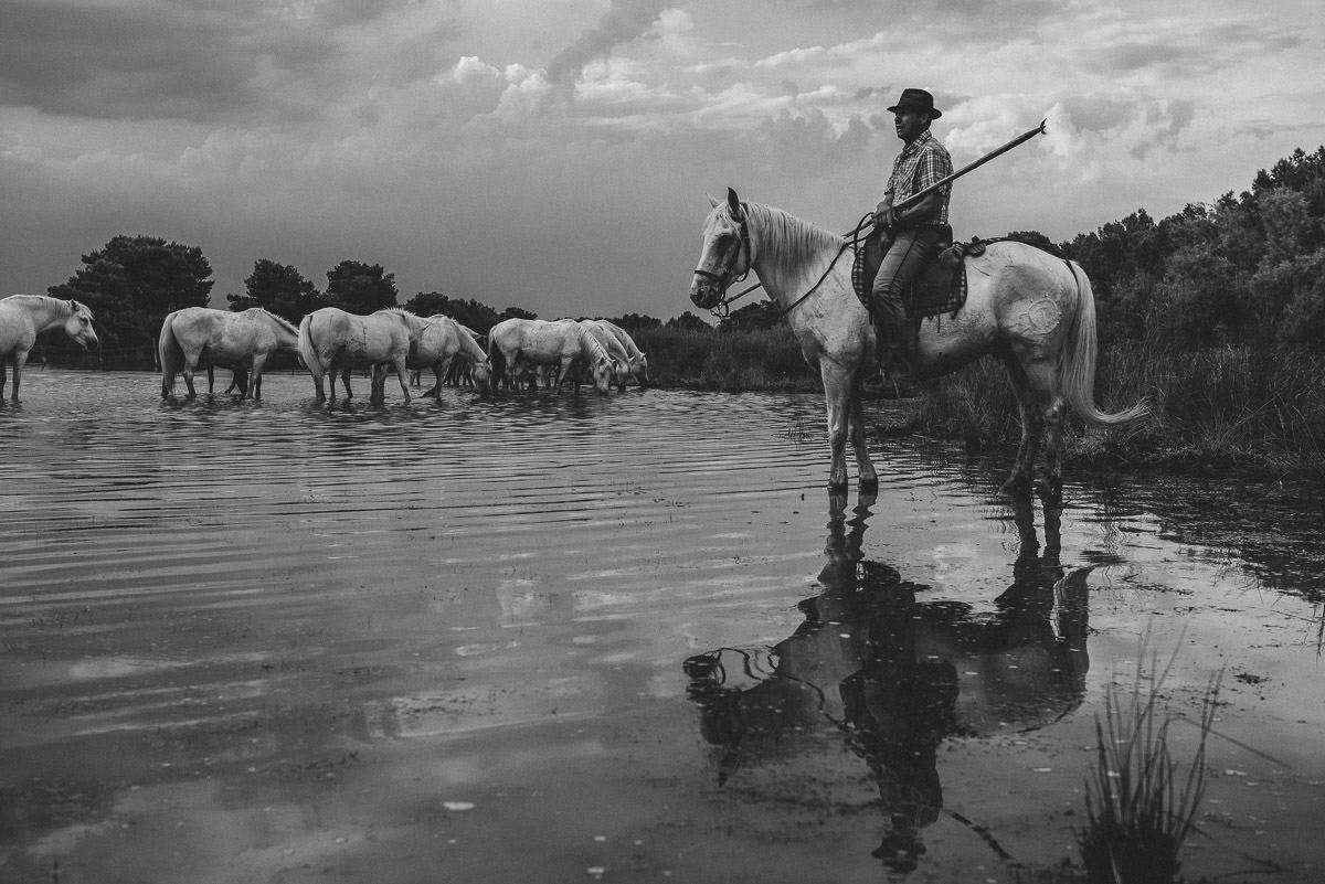
This first conversion to B&W is a favorite color image of mine
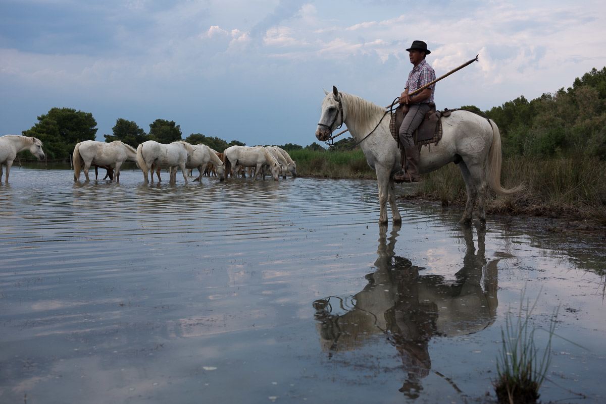
The backlighting from the bright late sky puts my subject in shadow, but makes for great reflections in the water.
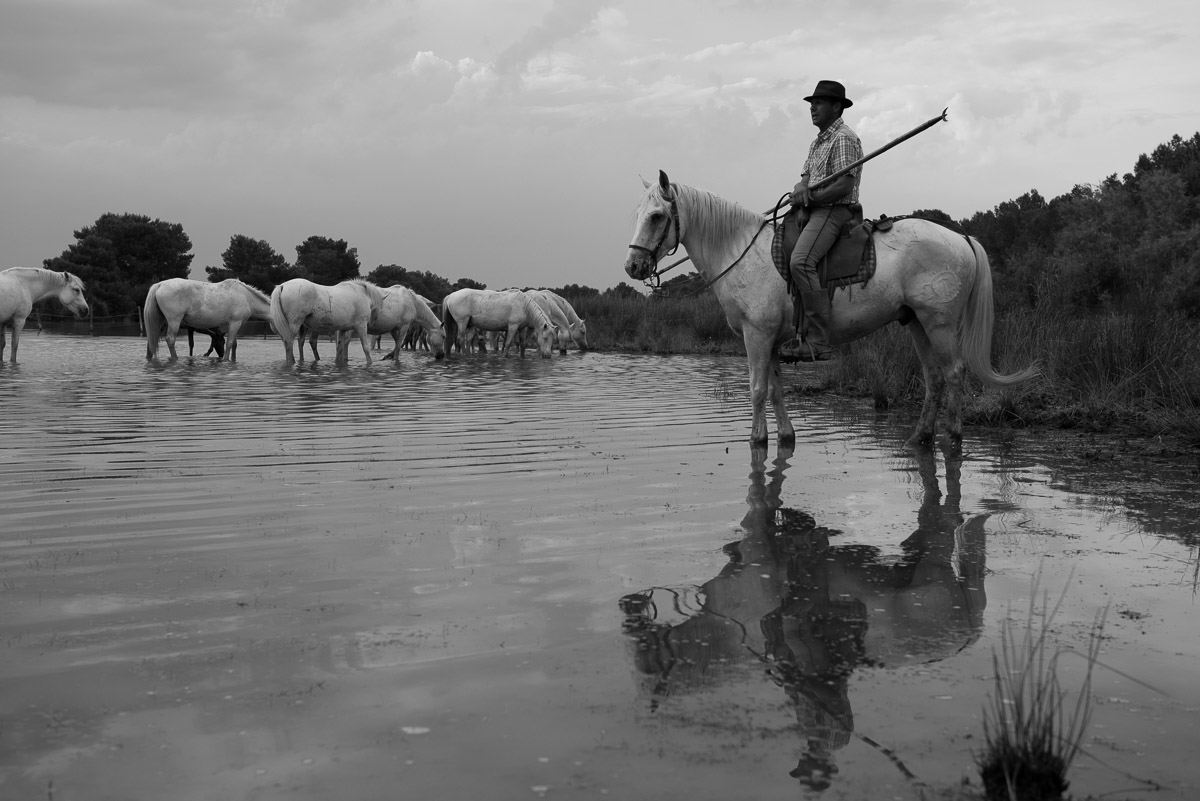
The straight default Lightroom conversion using the Black & White tab at the top of the Basic panel is pretty flat (low contrast), the shadows are blocked up (too dark) and the clouds lack crispness that I’m hoping to see.
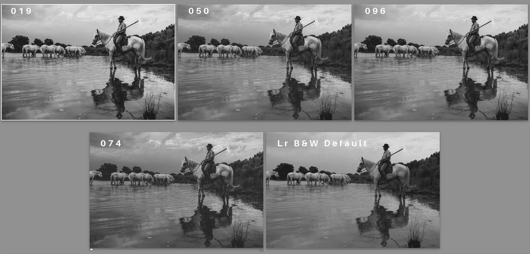
As I scrolled down the list of Winter 2016 Vintage Mono presets, number 019, struck me having a silvery quality that reminded me of the result I might get from a high contrast Black & White photo paper. I made a virtual copy of my original and applied 019.

Scrolling down through the presets some more, number 050 (below) had a similar quality to 019 but slightly darker overall with a strong vignette, darker sky and the look of a coarse, well defined Tri-X pan style film grain when it’s pushed to ISO 800 or higher.
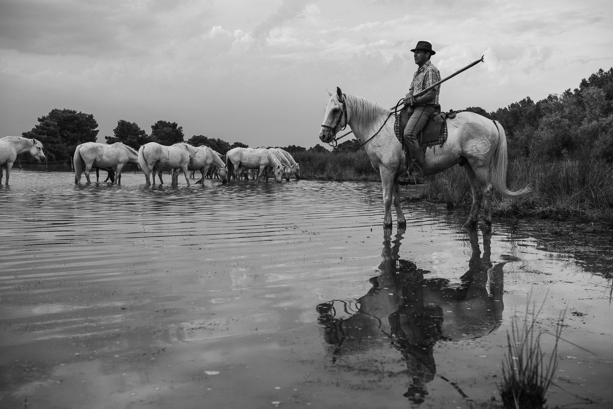
I made another virtual copy with this preset. Number 074 looked near perfect (below): silvery tones, details in the shadows, dramatic sky and added grain.
(Added Grain 074 vs 050.jpg) that had a softer, normally processed Tri-X pan look to it (below).

Another virtual copy. When I got to 096 (below), the scene brightened up, shadow detail opened up as well, I needed to take a closer look. One more virtual copy.
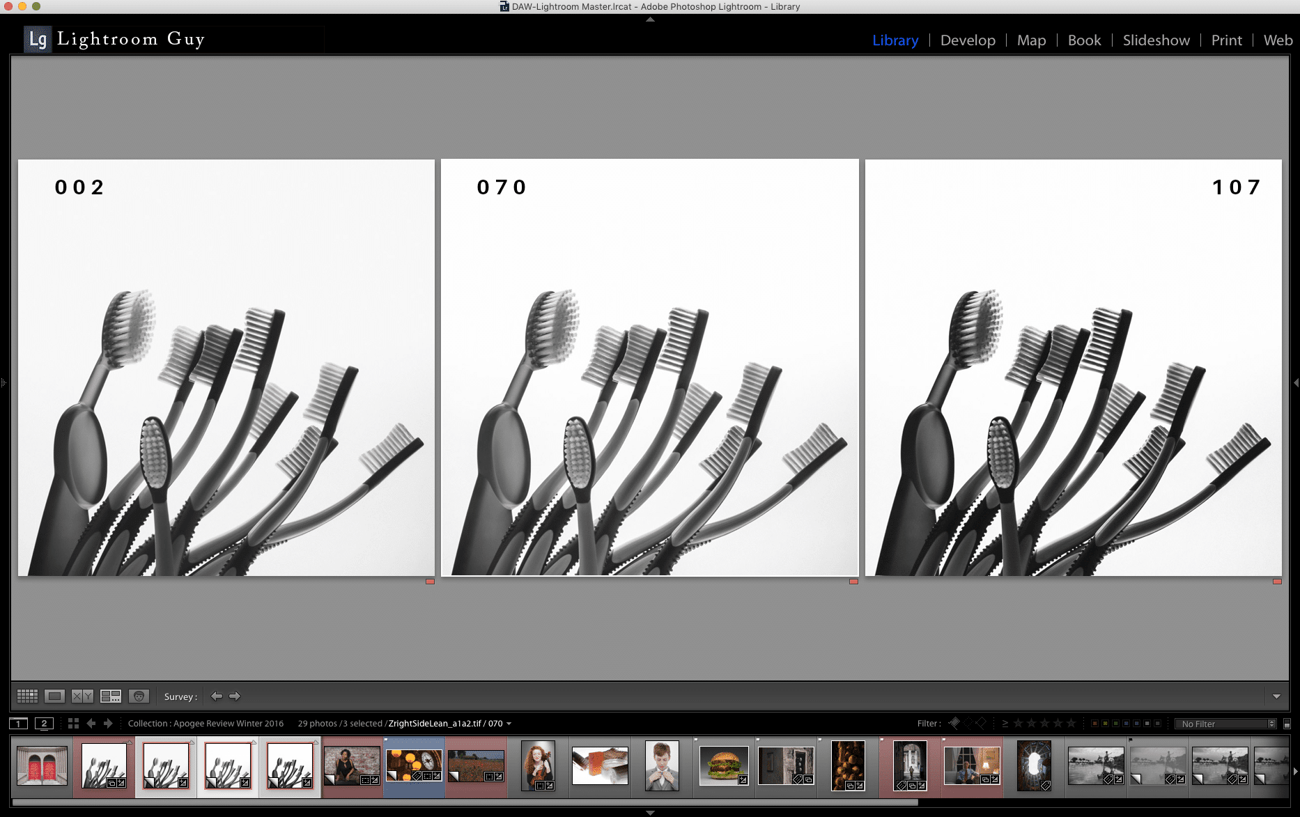
I selected all these virtual copies and compared them side-by-side in Survey Mode (below) to help me make my final decision
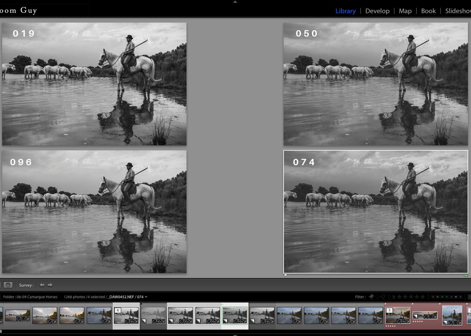
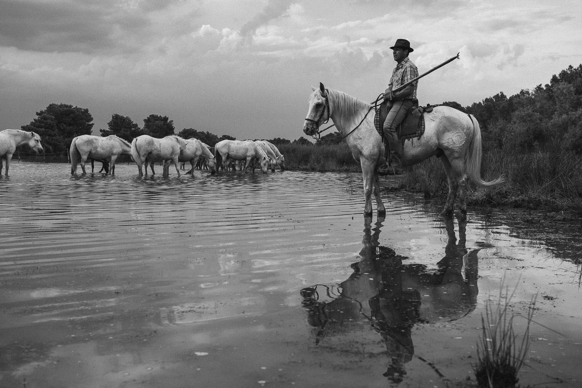
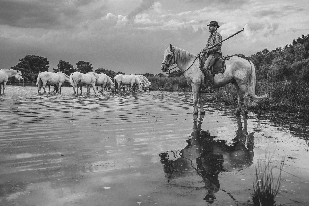
I settled on number 074, for the deep, rich range of grays and blacks. At this point I proceeded to make my final Develop tweaks – increasing my overall picture exposure by .10 in the Basic panel and using my two most used local adjustment tools: the Gradient Filter and the Radial Filter.
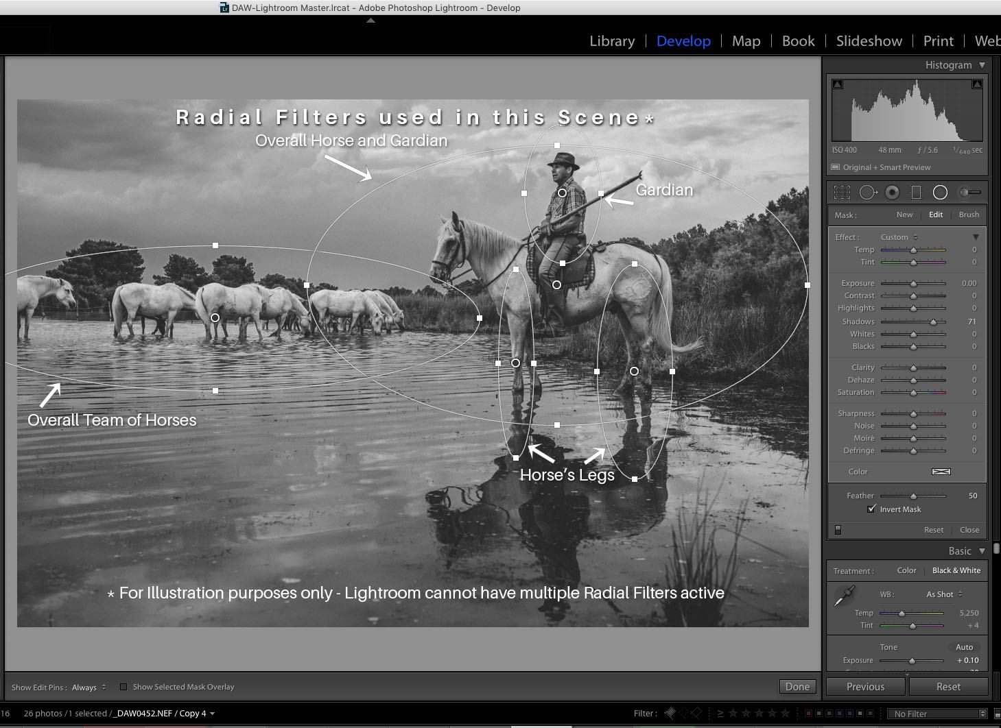
Here’s a photo composite that shows all the Radial Filters I created with Invert Mask checked –so adjustments appear inside each ellipse that I drew. The Shadow slider was adjusted for each Radial Filter ellipse to open the shadow details
Then, selecting the Gradient Filter, I dragged a gradient from the bottom of the photo over the water to open up the reflections and adjusted the exposure slider to.70.
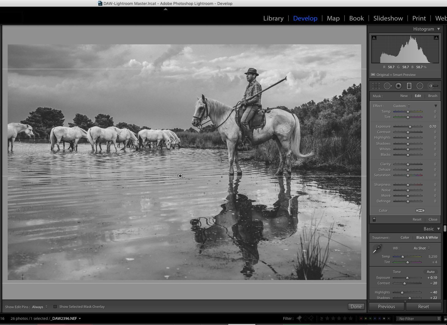
The final result (below) of these changes keeps the overall tonal quality of the scene rich and dramatic because I’ve only lightened very specific regions of my photo.
Experiment Two
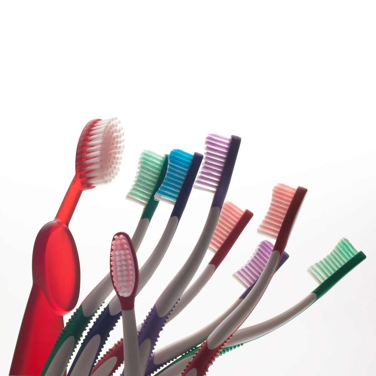
This next image, a studio photo of toothbrushes, was picked for its translucency and wide range of colors. There’s a beautiful gradient in the handle of the large toothbrush and the translucency of all the brush bristles is elegant.
First the default Lightroom B&W conversion (below). Not bad, but pretty flat. Meh.
After hovering over the list of presets, I’ve applied Vintage Mono 002 to start with (below).
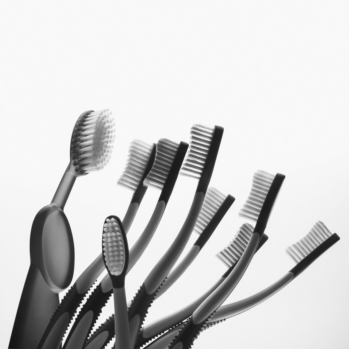
When I zoom in at 1:1, I see the added grain (below) is subtle, unlike the presets used for the Camargue photo. (And I’ll mention here that each B&W Prolost preset has grain added in varying ranges of Amount, Size and Roughness, so it’s important to examine the photos at 1:1 before making your final decisions.)

There’s also a slight vignette, as might happen with an older lens, a nice touch.

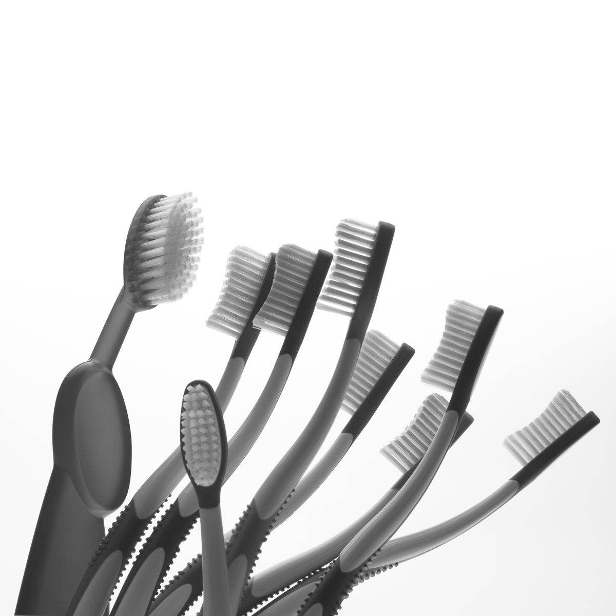
070 maintained better detail and translucency for the large brush handle and all of the brush bristles as well plus a smidge more contrast overall while keeping a touch of vignetting. It also had a more defined film grain that I liked.

Finally, number 107. It was seriously more dramatic. At first I really liked it. The Clarity and Contrast have been raised in addition to a Tone Curves contrast boost with less vignetting. However, on second thought, the subtle tonal variations of gray on the colors of the toothbrush mob were lost. (below) Overall, I decided this version is too dark.
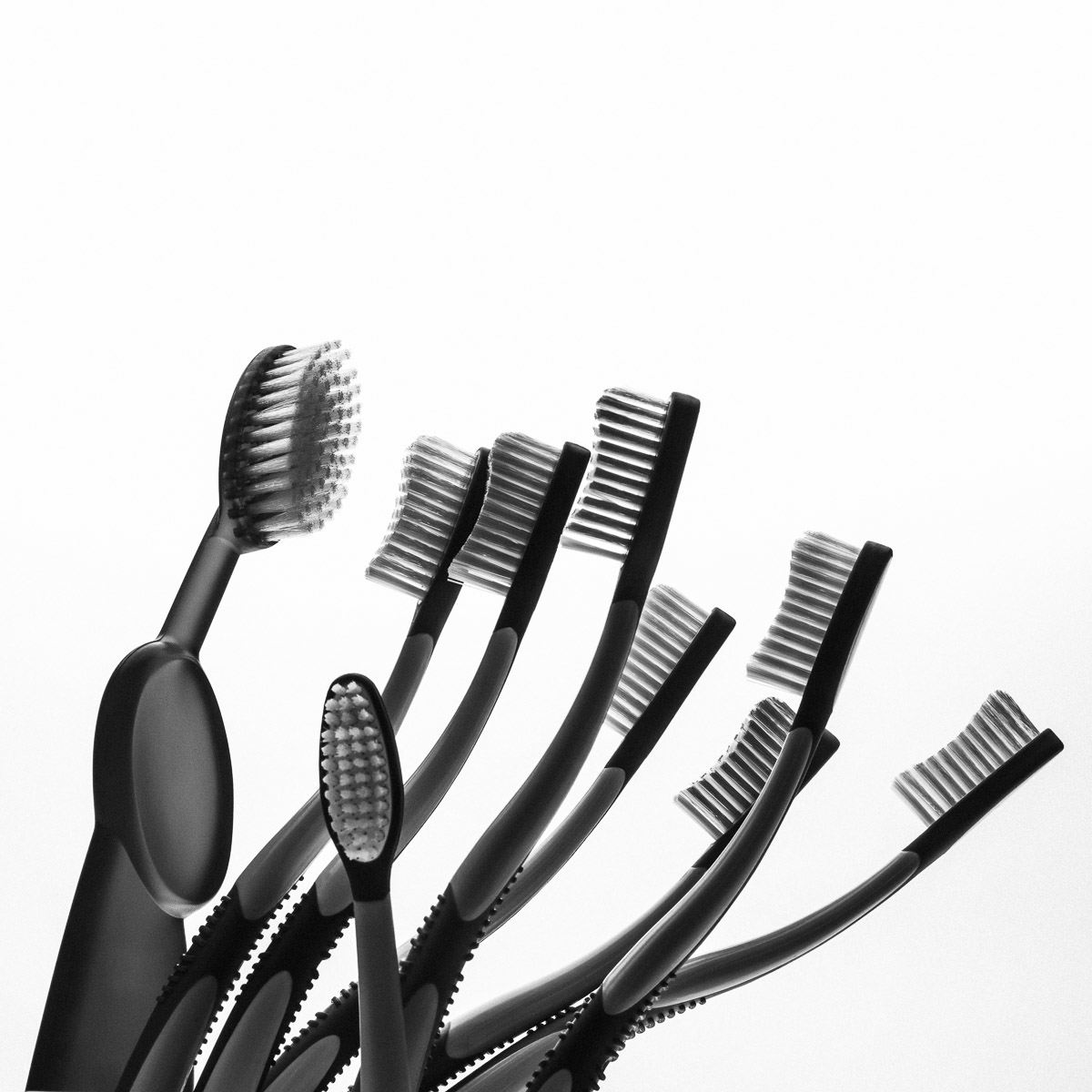
After comparing the three versions, I returned to 070 (the middle image), which had a better range of subtle toothbrush grays but slightly more contrast than 002.
Experiment Three
For this studio portrait, I was looking for a preset that yields good skin texture and separation of the violin and hair from the black sweater.
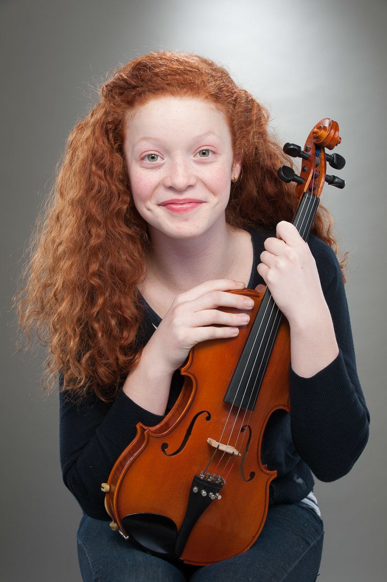
The straight Lightroom conversion lacks punch (contrast) and the sweater is blocked up and the violin’s wood texture feels muddy (below).
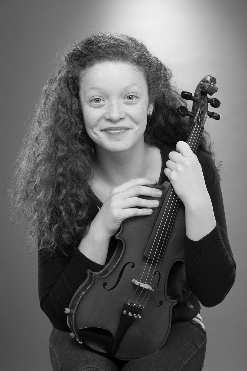
Vintage Mono 018 gave me nice soft skin tones but was slightly flat (below).
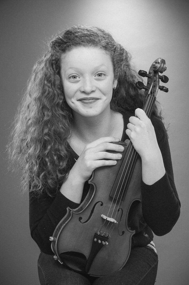
029 (below) made for a great violin, but added too much contrast for her face and the blacks in the sweater was still blocked up.
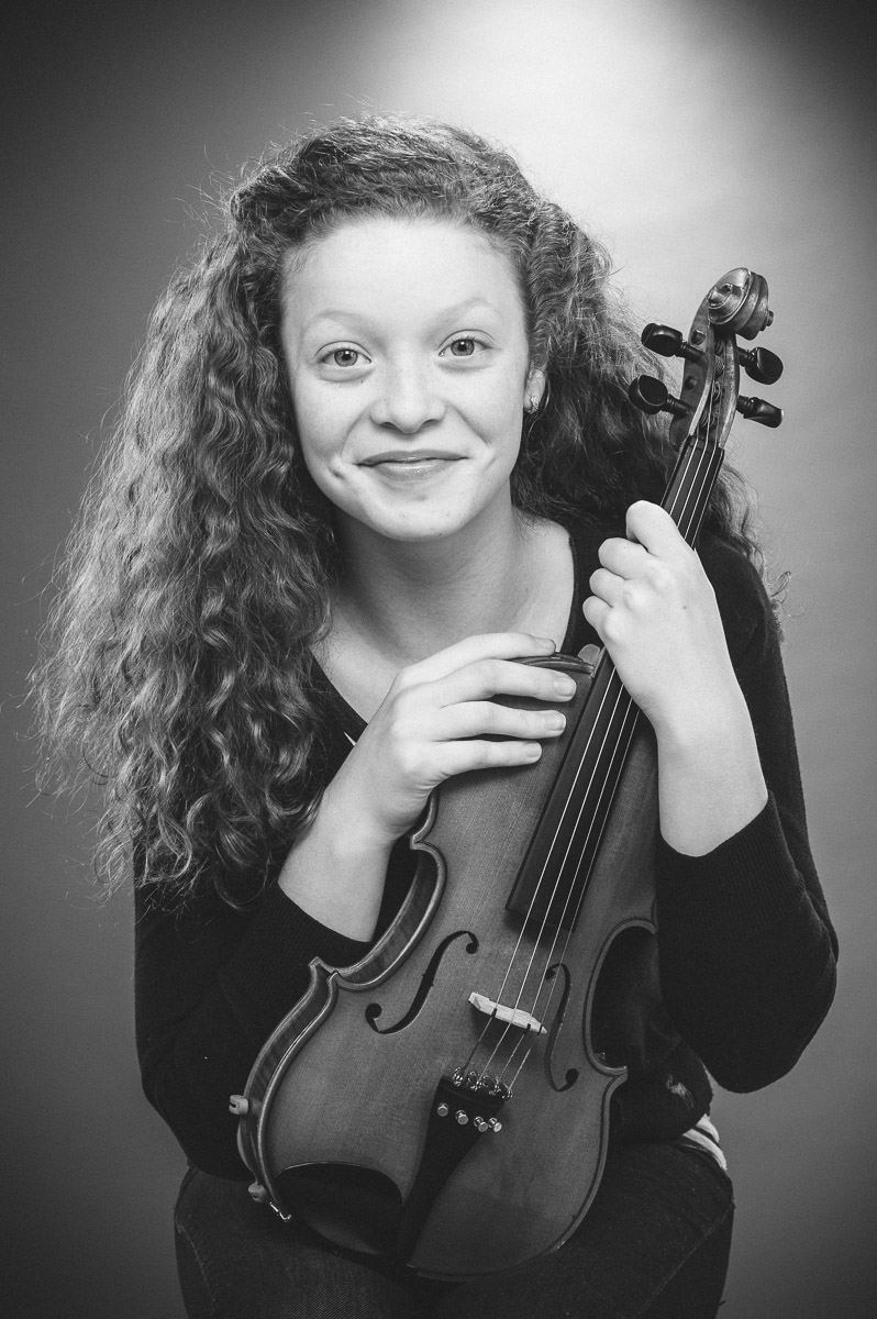
I finally chose number 056 (below), with the overall shadow detail and contrast I needed and a creamy skin tone with defined facial detail that wasn’t harsh.
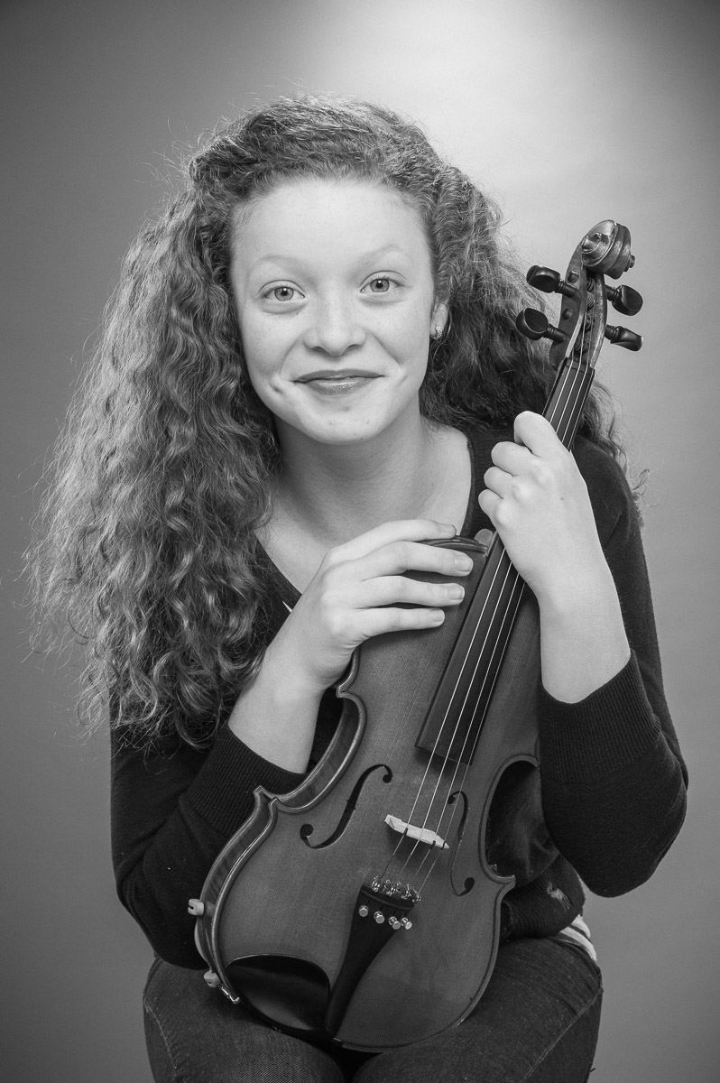
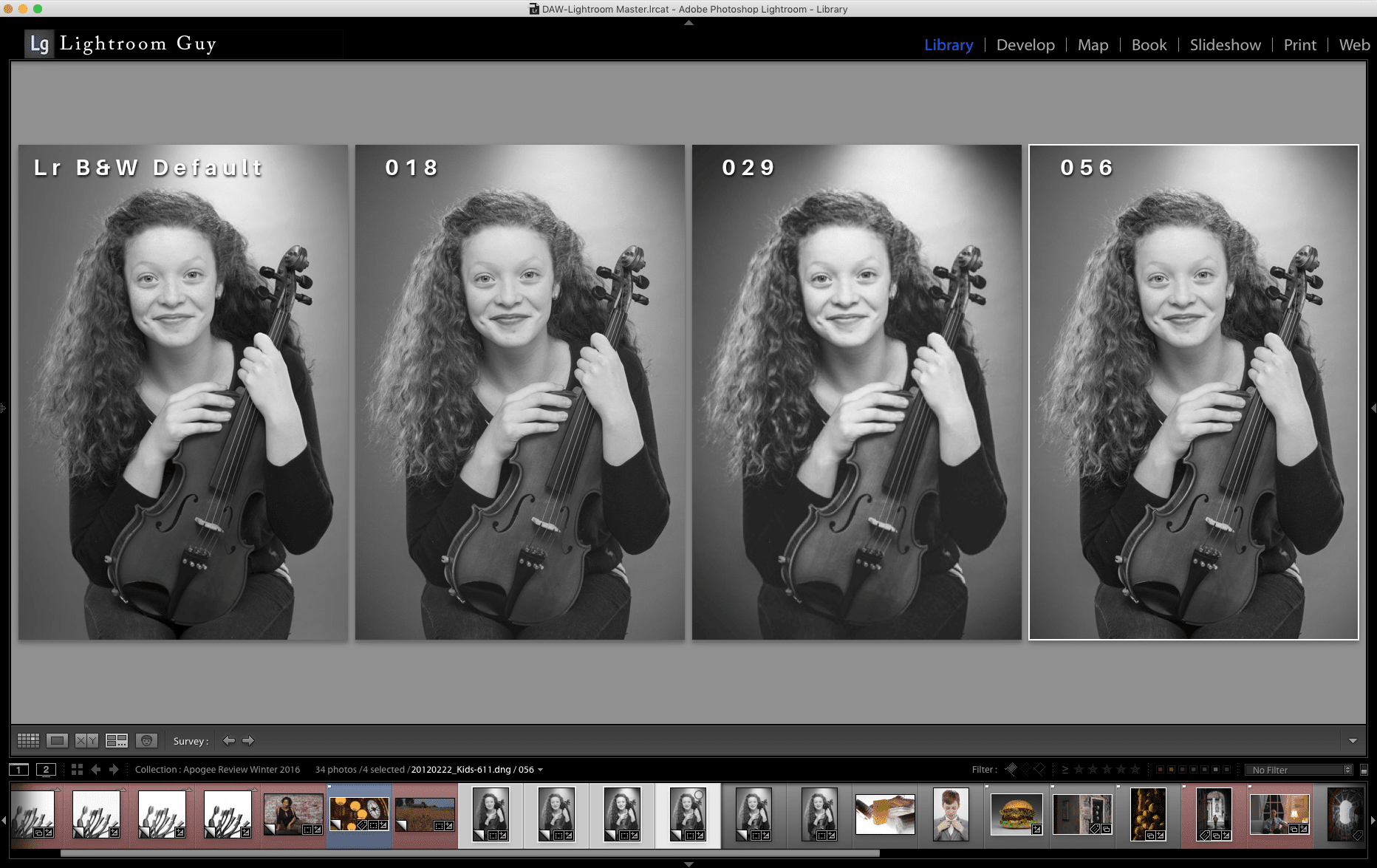
And since I loved the way the violin looked in 029, I took a minute to place a Radial Filter over the violin and added some local contrast (settings appear in the Radial Filter panel of the screen capture).

Experiment Four
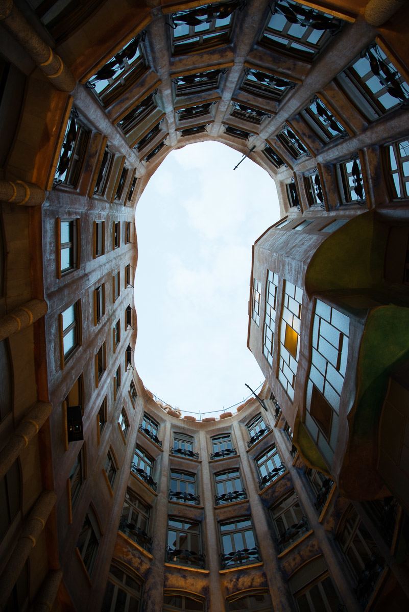
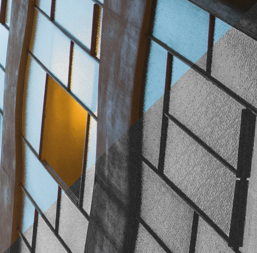
As a last trial, I went for a dramatic shot of a Gaudi apartment building in Barcelona, with its bright cloudy sky, dark shadows graduating down to near black around the perimeter and reflective windows.
I was looking for a preset that could give me a solid B&W starting point that could bring back the clouds in the sky and keep my shadows from getting too blocked up.
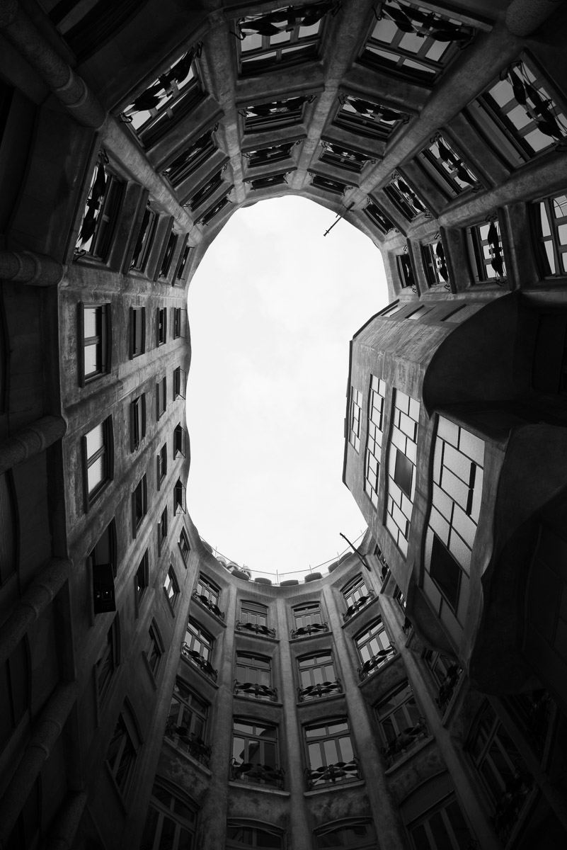
Again, a default Lightroom B&W was made as a virtual copy. Again, meh. No sky and Lightroom doesn’t make any contrast adjustments. Flat.
As I hovered over the presets, this time from the bottom up, nothing struck me until 074 nailed the cloud detail.
The preview navigator is below

After applying the preset, the photo really had a nice quality to it – the same 074 I liked for the Camargue photo (below).
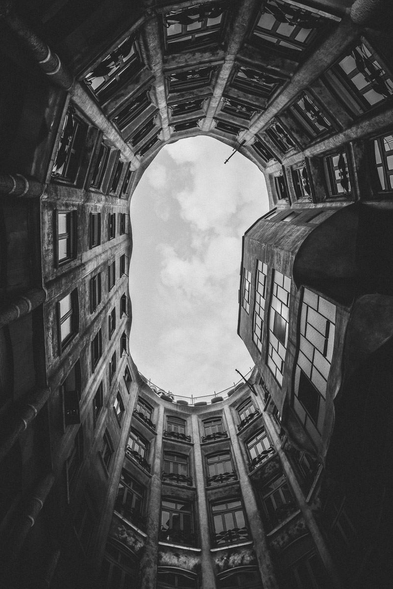
Big grain and a nice surprise, and something I never noticed in this photo – the windows are textured (below).
I continued up the list, but nothing really captured my attention other than 009 (below), which lacked punch

and 001, which had punch, but lost sky (below)
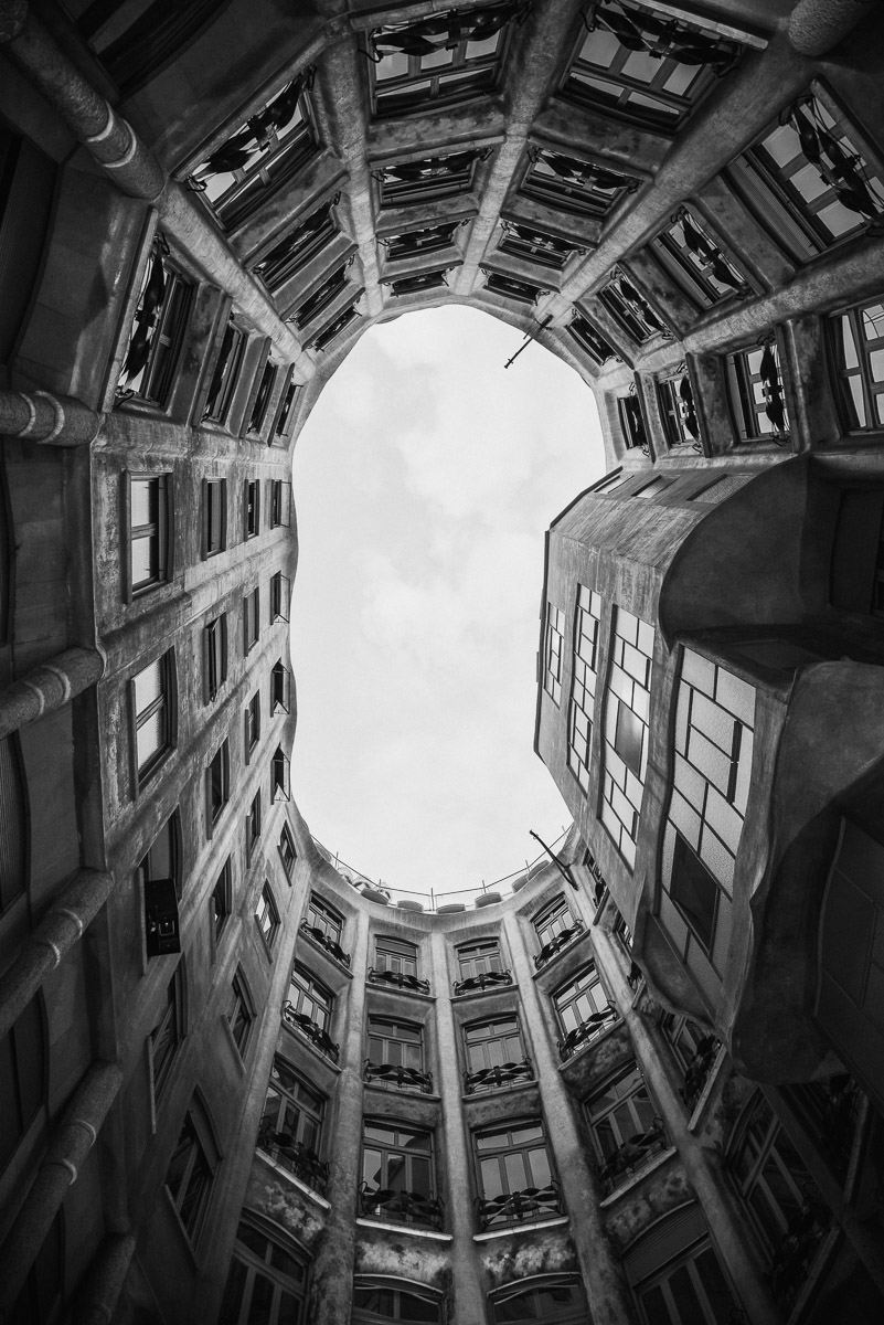
Sometimes, you just can’t have everything. After comparing everything (below) I went with 074. Again. Seems I have a favorite B&W preset.

I wanted to open up my perimeter shadow detail, so again to my favorite local adjustment tool, the Radial Filter and draw an big ellipse,

with the invert mask off this time and open up my shadow detail. (below) only around the outside of my image area.
When you start to compare versions side by side, you can see clearly why converting to B&W is hard. Simply, where a color photograph captures a palette of hues and tones, and saturation plays an important role, B&W reduces that same scene to a range of grays, where contrast, not color, plays the most important role.
Subtlety is the key to black and white conversions.
Unlike some develop presets that have user options to make adjustments, Prolost presets have been crafted with a particular look and it’s up to the user to make adjustments.
I couldn’t find a logical structure to order of the presets and I would have liked a little more organization. Lightroom beginners might find that challenging. But even so, this is a masterful set of presets.
I suggest jotting down which variations seem right while scrolling over the list and then applying the presets to a few virtual copies for comparison as I have done for this review.
Here’s a tip, after you’ve made changes to a preset: to save a modified preset as a new preset – click the plus on the right side of the Presets panel to open the New Develop Preset dialog. Click Check All but make sure to leave Auto Tone and Auto Black & White Mix UNCHECKED

Lightroom Guy, D.A.Wagner Bio
D.A.Wagner is a digital photographer, educator and entrepreneur. Starting as a special effects photographer in 1979 and then co-founding Photo District News in 1980, he acquired his first computer in 1984 to combine traditional photography with digital illustration in the darkroom.
Shooting for BusinessWeek, Discover, Time and a slew of medical publications ultimately led to assignments in pharmaceutical advertising, where his skills as a digital retoucher were refined. For nearly 10 years, he was an adjunct professor at New York’s prestigious Fashion Institute of Technology teaching digital photography and Photoshop, which eventually gave rise his private digital photography consulting and coaching business, Lightroom Guy.
As an Adobe Certified Expert and Certified Instructor who consults with established photo professionals, corporations and serious photography enthusiasts, D.A. is the top private photography coach in the U.S. on WyzAnt.com. Along with his Lightroom Guy partner, David Mark Erickson, he is currently producing a series of instructional Lightroom videos for Pluralsight.
Article by David Wagner of lightroomguy.com


Leave a Reply