
Authors Note: (The references for this material are “Macworld Photoshop 3 Bible“, Second Edition, by Deke McClelland (IDG Books), relevant articles in “PC Photo Magazine”, and the videotape “Michael Kieran Presents Color Correction in Photoshop”, (DPA Communications). The majority of this information was gleaned by multiple viewings of this videotape, while making copious notes, then trying the techniques. The calibration settings and numerical limits are, in the main, those suggested by the videotape, and quotes are from the videotape dialogue. Purchase of this videotape is highly recommended, as it contains much more valuable information then was included with this article.)
It’s so much fun using the imaging program Adobe Photoshop, that most of us just jump right in, playing with the different controls to modify and improve our own photographs. In many cases, the techniques we stumble upon or learn from books will do us very nicely in the beginning. However, it soon becomes apparent that, with all the many controls available, you can spend hours on a single image, trying one technique after the other, and rarely be able to duplicate any single effort later. What’s more, you may not even realize that, at times, you’re actually damaging the image rather than improving it.
The techniques we will examine here provide a systematic way to improve any image, whether it came from a digital camera, a scanner, a Photo CD, or a Picture CD. This will be color correction using predetermined calibration parameters. Once you practice these ideas, you can optimize any image in about ten minutes, and you’ll be assured of the best possible resulting prints.
Color Models
For printing, I use the CMYK model, while for the Web, TV monitors, and photography, I use the RGB model. Once your image is onscreen, you can change between models, by using IMAGE–>MODE, and making your choice. Will you work in the RGB or CMYK color model? Each has its specific advantages:
The RGB model gives a wide range of colors, and produces smaller files.
The CMYK model produces the specific colors that will appear when the image is printed.
The CMYK model allows more subtle adjustments to be made (there are four channels rather than just three).
What We Will Do
We will learn to correct five possible areas:
1.) highlights.
2.) shadows.
3.) neutral midtones.
4.) skin tones.
5.) overall contrast.
1. We will begin by analyzing the tonal content of each image.
2. We will then learn to establish aim points for highlights, shadows, and midtones, using the EYEDROPPER tool and INFO palette in Photoshop. These “aim points” will be standard, irrespective of the image under analysis, and may vary only with the printer and paper you use. (To ensure proper aim points for your printer, a method of making a calibration chart is provided, use of which the videotape recommends.)
3. Using simple Photoshop facilities, such as the LEVELS histogram or the CURVES, together with the EYEDROPPER tool and INFO palette, we will look at the existing tonal values of an image, and reconfigure them to suggested calibration settings.
The LEVELS histogram is a graph of the pixels that make up the image, together with three slider controls that allow us to vary settings of the shadows, highlights, and midtones. You can do this to the entire image, or on a channel-by-channel basis–the more desirable method. By itself, this is a versatile tool, although the three adjustments are somewhat limited in scope.
The CURVES allow us to do the same things that the LEVELS histogram will do, but with much more versatility and precision. In addition, You can use CURVES for adjusting contrast in specific areas of the image, without affecting other areas.
OPERATIONS THAT SHOULD BE AVOIDED
You should not use IMAGE –>ADJUST–>AUTO LEVELS, or the IMAGE–>ADJUST–> BRIGHTNESS/CONTRAST commands, as they tend to damage the final image.
You’re trying to achieve the greatest tonal range between light and dark areas in your image. Sometimes, AUTO LEVELS will help improve image contrast, but sometimes it makes the wrong decisions about image tones, and ruins the image. (To understand what BRIGHTNESS/CONTRAST does, look at the LEVELS histogram that shows the tonal values in the image. In the histogram, the shadow areas are shown at the left, while the highlights are shown at the right. The midtones are in the middle.)
If you reduce brightness in an image, using BRIGHTNESS/CONTRAST, the histogram shows you have reduced the tonal range. If you use BRIGHTNESS/CONTRAST to increase the contrast of the image, the histogram will show that detail has been removed from both highlight and shadow areas. You will use LEVELS and CURVES, instead, to adjust our images without reducing the tonal range, or removing detail from shadows and highlights.
TONAL ANALYSIS OF THE IMAGE
USING THE THRESHOLD UTILITY
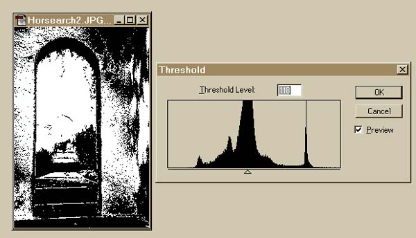
It’s important to be able to find the brightest/darkest parts of an image, in order for you to be able to correctly adjust the highlights and shadows. This is quite easy to do:
1. Go to IMAGE–>ADJUST–>THRESHOLD.
2. By dragging the slider to the right, You can find the darkest parts of the image. Drag the slider to the left, to find the brightest areas. This is the same for both RGB and CMYK images.
When you’re finished with THRESHOLD, click <CANCEL> rather than <OK>, to avoid affecting your onscreen image.
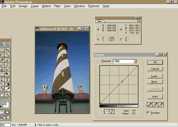
USING THE EYEDROPPER TOOL AND THE INFO PALETTE
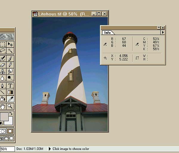
The EYEDROPPER tool is the one you’ll use most often, in conjunction with LEVELS, CURVES, and the INFO palette. It’s selected from the toolbox. You can bring up the EYEDROPPER palette by double-clicking on the EYEDROPPER tool when you select, it, or by pressing <RETURN> at any time after selecting it. (When using the EYEDROPPER palette, avoid the ‘single pixel’ sample size, as it is too selective. Instead, use the 3×3 or 5×5 average settings.)
Once you have the EYEDROPPER adjusted, you can view the INFO palette by activating WINDOW –> SHOW INFO, from the top menu bar. Moving the eyedropper inside the image will reveal the pixel levels for each channel, on the INFO palette.
IDEAL AIM POINTS FOR TONAL ADJUSTMENT
Highlights
For CMYK, you must ensure that, in the highlight area, every dot is 3% or larger, or it won’t be visible in the printed image (In actual fact, using a calibration chart on YOUR printer and paper will show you exactly what number you should aim for. This will be explained in more detail later). Because cyan is the weakest color in CMYK, the actual ratio that’s standard for highlights is 5% cyan, 3% magenta, and 3% yellow. In the brightest areas, you “don’t expect to find any black ink!”
For RGB, in theory, in the highlight area, you’d expect to see 255/255/255, for each of the three channels. However, due to monitor limitations, etc., a value of 245/245/245 is more realistic.
Shadow Areas
For the CMYK model, suggested values for shadow areas are 70% cyan, 60% each for magenta and yellow, and 90% for the black channel. This will yield good shadow detail when printing.
For the RGB model, using the EYEDROPPER, in theory you would expect to see RGB 0,0,0 for the shadows. In practice, it is better to aim for RGB 10,10,10.
Midtones
For the RGB color model, a neutral midtone shows equal numbers in all three channels. In the CYMK model, a totally neutral tone would indicate equal values in all three-color channels, and zero in the black channel. In practice, it turns out that, “if the CMYK color model shows a bit more cyan than yellow or magenta in the neutral midtones, the color will print more neutral.” Generally speaking, if your midtones are correct, the remainder of the image will look correct.
TONAL ADJUSTMENTS USING LEVELS
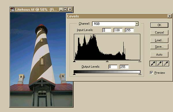
These adjustments may be made to an RGB image as a whole, but it’s more effective to adjust the image in a channel-by-channel basis. By moving the highlight and shadow sliders in from the extremities of the scale (to improve contrast) on each RGB channel individually, You can improve on ‘modifying the image all at once’.
A CMYK image should always be adjusted channel by channel. This is because the black channel must be adjusted independently of cyan/magenta/yellow, so that neutral tones won’t be affected. Because of deficiencies in cyan ink, if you make a CMYK image lighter or darker as a whole, it will create color shifts.
Levels Technique
1. Use the EYEDROPPER and INFO palette to map the highlight and shadow tonal ranges.
2. Open the LEVELS histogram (IMAGE –> ADJUST–> LEVELS)
3. For each channel separately, move the left INPUT LEVEL slider to the right, until it’s below the first actual pixels shown in the histogram. Move the right INPUT LEVEL slider to the left, until it’s below the first actual pixels shown.
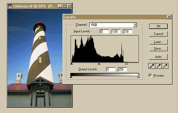
4. The neutral midtones can be adjusted channel by channel, as well. The normal adjustment for the middle slider is 1.00. If the number is increased, adjusting an individual channel, that color will become more intense. Decreasing the number decreases that color. Therefore, colorcasts in your image may be corrected using this technique.
5. Brightness in the RGB color model may be adjusted by changing the setting of the middle slider, working on all channels at the same time. Be sure to check your highlight and shadow settings again, after doing this, and be wary of colorcasts being introduced.
TONAL ADJUSTMENTS USING THE CURVES TOOL
This is the main tool for color correction. The CURVES tool lets us “remap tonal values” so you can optimize image tones.
Leave a Reply