
One of the most important tools the digital photographer has for obtaining perfect exposures is the histogram. While originally available only with upper end cameras, almost all cameras today have the feature available to the photographer. Most digital cameras allow the photographer to see the histogram of an image just captured, and many now have the ability to see it “live”, before the shutter is pushed. There are many options for how and when the histogram will be displayed, so it is best to check your manual if you are not sure. To understand how the histogram works and what information it gives the photographer, it is helpful to go back to the history of photography.
Many people assume that the histogram originated with the advent of computer image editing and the digital camera. But, it really has its origins much earlier than that, when film was king. In about 1939, Ansel Adams and Fred Archer formulated a technique for determining optimal film exposure and development. They called this technique the “Zone System.”
Ansel Adams believed that the “perfect” print, derived from the combination of proper exposure when shooting a scene and the subsequent development of the negative in the darkroom, contained eleven zones of tonality or value. This was considered a full tonal print that represented the visual world as a series of tones ranging from black to white.
Zone
Description
0
Pure black
I
Near black, with slight tonality but no texture
II
Textured black; the darkest part of the image in which slight detail is recorded
III
Average dark materials and low values showing adequate texture
IV
Average dark foliage, dark stone, or landscape shadows
V
Middle gray: clear north sky; dark skin, average weathered wood
VI
Average Caucasian skin; light stone; shadows on snow in sunlit landscapes
VII
Very light skin; shadows in snow with acute side lighting
VIII
Lightest tone with texture: textured snow
IX
Slight tone without texture; glaring snow
X
Pure white: light sources and specular reflections
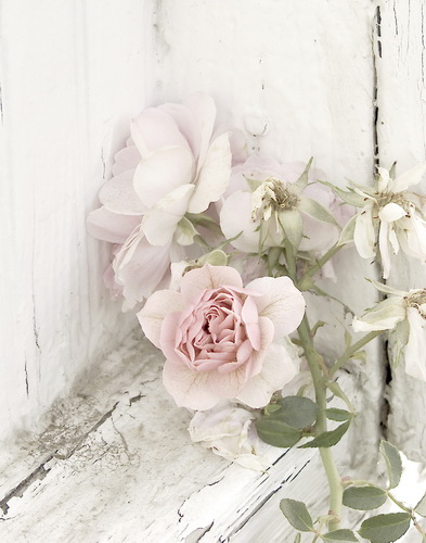
The following image represents such an image containing all eleven zones of contrast, or “dynamic range.”
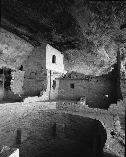
Every tone described by the previous chart can be found within this image. If we were to print this image out and then cut it up into small uniform squares, and then create eleven stacks, each one containing the squares according to the zone it represented, and then counted the squares in each pile, we could graph the result as follows:
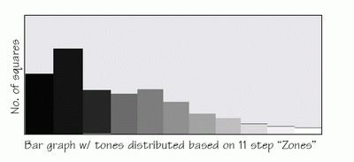
This represents a histogram of the distribution of tones based upon the eleven steps of the zone system.
We can take this model and extrapolate it further. A black and white digital image is said to have 256 levels of tonality or value, much more than the eleven of the original Zone System. If we chopped our image into very small pieces, let’s call them “pixels”, and arranged them on the a graph according to the 256 tones they corresponded to, we would see the following histogram:
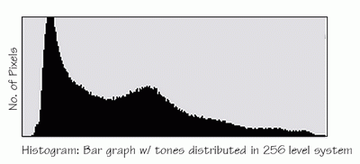
This histogram represents an ideal image, where the entire tonal range is represented within the image. In examining the above histogram, one can see that on each end of the graph, the value of the extremes equals or approaches zero. This is an important observation as we will see in the next example.
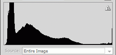
This image is underexposed. Its histogram looks like:
This time the bulk of the histogram is pushed up against the left side of the graph, which represents our darkest tones. It is important to see that while our ideal image had none or almost no pixels at the extreme left of the graph, the histogram in this image has an enormous amount. We call this “clipped”, because essentially our distribution of the values of the scene were cut off at this extreme.
We could make the assumption that had this image been properly exposed, the distribution of the dark values would have approached zero like it did in the “ideal” image. This histogram tells us that those values that would have existed have been all rendered to complete black in the image. The varied detail in the dark areas of this scene have thus been lost as a result of this. That is, in one sense, the definition of an “underexposed” image: because not enough light from the scene reached the camera’s sensor (underexposed), information or details were lost in the darker areas.
Let’s look at the opposite scenario.
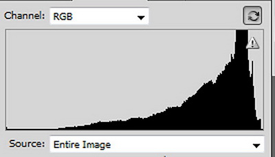
This image is “overexposed.” Its histogram looks like this:
In the underexposed image the distribution was pressed against the left side of the graph and was clipped. Here we see that the opposite has occurred. Now the whites are pushed up against the right side of the graph representing our lightest values, and they are “clipped.” In other words, valuable information from the lightest areas of our scene is lost because these values have been rendered to complete white.
It is important to realize that in both scenarios, the “clipped” information is lost forever. Let me repeat that: these values cannot be retrieved from the image. And this is why getting the proper exposure in a digital image is so critical. Despite the common misperception, an image program such as Photoshop cannot fix this image. That is why it is so important that your exposures be as exact as possible. If they are “clipped” on either end of the histogram, detail will be lost and the image will be unacceptable for most uses.
This is why it is important for you to know how to turn on the histogram feature of your camera. When it is on and you review the image on your camera after your exposure, you can examine the histogram and look for these kinds of problems. If your histogram shows your image is “clipped” on either side, adjust your camera controls until you obtain the correct exposure and take your picture again. Don’t wait to get home and find out that the image is bad. Then it is too late.
So far I have been shown you black and white images. A color image works the same way, except instead of only having one channel of 256 values, there are three. One for each of the red, blue and green primary colors.
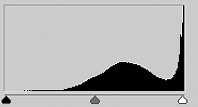
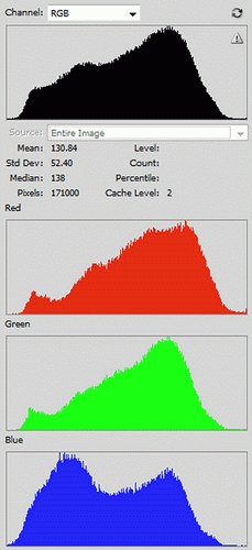
Let’s look at a good color image, and what the histograms look like.
In the screen shot on the right you see the average composite histogram of the three channels at the top, and then the representation of each of the channels separately. Note that all of the histograms are centered with no “clipping”.

It would be wrong to make the overgeneralization that all images need to have this neat bell curve distribution. Many properly exposed images have histograms that do not have this characteristic curve.
This image is called “high key” because most of its tones are in the lighter end of the curve. It is perfectly exposed and represents the photographer’s interpretation of the scene. Note however that there is no “clipping”.
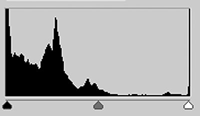
The opposite is called a “low key” image where the majority of tones are at the dark end of the scale.

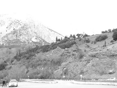
Now let’s look at an image representing a common situation.
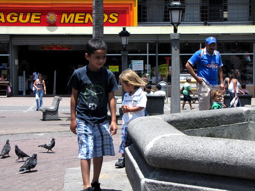
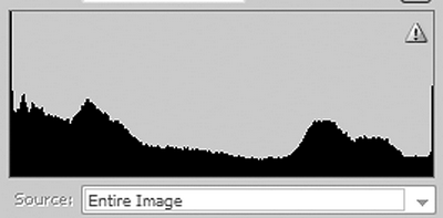
As you can see, the histogram of this image is “clipped” at both ends. This means that information in the darks and the lights have been lost. This commonly happens when the photographer tries to take a picture in the middle of a bright sunny day. The scene exceeds the capability of the camera’s sensor to capture the range of lights and darks, resulting in a poor picture that has too much contrast to be pleasing. Unfortunately this is what many tourists’ images look like and why so many are disappointed with their results.
What can you do to avoid this? First of all, make sure you view your image’s histogram before you leave any given location. Next, realize that under circumstances such as this, capturing the entire tonal range is an impossible task. If you can, return here at either an earlier or later time of day when the contrast of the lighting is lower and can be readily captured by the camera. Early in the morning or late in the afternoon are the best times of the day for lower contrast lighting. Try to avoid shooting images between 10am and 2pm when the sun is high and the contrast is greatest. If that is not possible, consider using a flash. Even your on-camera flash can sometimes help remedy this situation. It takes practice; be sure to read your manual beforehand to find out how to use “fill-in” flash. In a professional situation, a photographer could also use some sort of reflector to fill in the shadows in the nearer areas. The best advice most would give is, “Give up and come back later!”
Grab your camera, grab your manual and start practicing with the essential histogram tool, and you’ll begin to see how you can obtain images with great exposure.
by Michael Fulks
All text, graphics and photos: © Michael Fulks. All Rights Reserved.
Leave a Reply