
When you’re making a great photograph, there are many components to keep in mind. To create a perfect composition, you must consider more than light angle and quality, depth-of-field, and shutter speed. You must consider what we call Design Concepts.
Specifically, you must think about line, color, value placement of subjects, shadows, isolating, framing, pattern and texture, shape and form, and reflections. In this, the first of three articles we’ll examine the first three concepts.
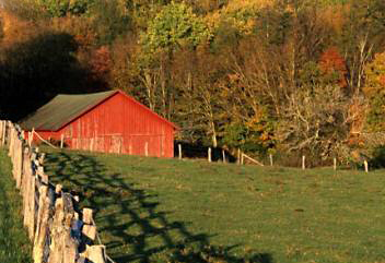
The fence carries the viewer’s eye to the barn.
LINE
Line can be very important in helping the viewer work his way through your image. The effect of line can be presented in several different ways. The first is using line as a lead-in to the main subject. When you’re doing this, the leading line is just a supporting part of the picture. Interestingly, it can be a main part of the picture at the same time.
How leading line is used is up to the individual photographer, but the main principle to keep in mind is the line needs to start at the bottom of the frame and work its way back toward a strong object. The main subject can be just about anything–ranging from a tree or a barn to fall color along a trail.
Similarly, the leading line can be almost anything–including tracks in the snow, a fence, or a trail. Any line you select that helps take the viewer up into the photograph can work.
Another way to use line is to compose your photo so that intersecting lines for different subjects in the frame work together. While it’s nice to be able to have one of the lines come from a corner to enhance the impact, this doesn’t always have to be the case. Creating intersecting lines within the framework of the image can lead the viewer’s eye up, around, and through the image.
When you’re using the technique of intersecting lines, it’s helpful if the different elements that occur where the lines come together are different in color, so the change in direction is obvious. The color changes can be subtle. However, the more drastic the color changes, the more obvious the impact of the line and its importance to the image. (Sometimes you can use this idea so that the viewer doesn’t realize your intention.)
A third way to create the feeling of line is with repetition. For example, you can climb a mountain and take a shot of the lines of peaks in front of you. (This type of shot is stronger if the subsequent mountain lines have fog or clouds between them.) Another way to use repetition in lines is to photograph through a stand of trees.
This technique works best in areas where the leaves have already fallen, so you’re looking through a group of trees trunks without the clutter of foliage.
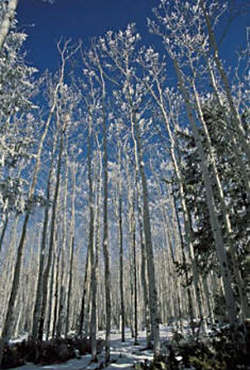
A group of aspens trees shows how multiple vertical lines creates repetition.
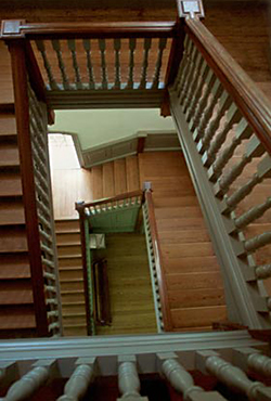
The staircase is a group of lines going in different directions, but they all lead the eye to the bottom of the stairs.
Whichever type of line element you use, remember it doesn’t have to be a straight line. Curved lines can add intrigue to a shot, as opposed to the stark direction of a straight line. An illustration of effective curved lines can be seen when you’re shooting linear shapes that have been created by wind moving sand.
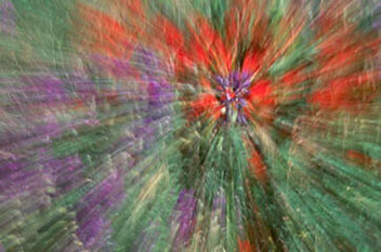
Zooming a group of flowers highlights the color rather than the flowers themselves.
COLOR
Color can be a powerful tool for creating a photo that captures people’s interest. You can use a mix of many strong colors, soft or muted colors, or a single color, thus creating mood. Color can either dominate the image or it can blend into the overall scene. Color doesn’t even have to take up most of the frame to be a strong element.
A small patch of color in a monochromatic scene will automatically draw the viewer’s eye to the color and the subject. Combining colors is another way to pull the viewer’s eye into the scene.
Some colors create more impact than others, and no color makes a bigger impact than red. This fact is the reason many signs, emergency lights and ads are red. They seize your attention. If you use red to basically fill the frame of your image, you need to include different shapes in the red in order to break up the overall image.
A good example would be a photograph of flowers in which interior shapes create shadows. Fall is a good time to try to work with red. Red maple leaves, for example, whether your photo is of a single leaf or a single tree, will create the impact you’re looking for.
If you’re able to find a subject that has a nice wash of a variety of colors, you can try different frame-filling compositions to communicate that color is your subject. By working with a zoom lens in the range of 70-200mm or 100-300mm, you can use a long shutter speed and zoom from one focal length to the other. What this zooming does is to create an interesting effect in which the colors are the first feature of the final image.
In nature, more often than not, the contrasting colors you see next to each other work nicely together. Unlike human companions on a golf course who may unwittingly decide to wear outfits that clash, nature tends to select hues that compliment one another. However, the unlikely color combinations people select for their homes or fences often make great photographic backdrops for other subjects.
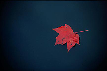
Red always gets a viewer’s attention as this leaf on the water shows.
The basket of flowers on the right makes a wash of different colors.

Snow photography can provide bright color contrasts. A good combination to look for is a group of snow-covered trees with a crisp blue sky in the background. While other design concepts such as line or pattern are at work in such an image, color is a key element.
Your eye is your best tool when you’re looking for strong color combinations. Seeking a color pairing that jumps out from the ordinary–such as red and blue–is easy, but many other colors present good contrast, as well. Strong warm colors against cool colors will also hold the attention of the viewer.

Even though it’s a small portion to the overall scene, this lone tree pulls your eye right to it.
Value Placement of Subject
You’ve probably heard it’s best to have an odd number of subjects in the frame unless the even numbers are close to each other. The main concern in either case is the placement of the subject(s). When you’re photographing wildlife, you typically want to try to fill the frame as much as possible while staying away from the bull’s-eye effect of placing the subject in the center with lots of room around it. In landscape photography, subject value is best achieved with a single, strong subject contrasted against the background.
The photographer must decide where to place the subject. The single subject can actually be a group (i.e. trees) clustered together.
A placement that one photographer might like might not work for another photographer. Subject placement is subjective. The rule of thirds (in which you divide your viewfinder into a tic-tac-toe grid and place the subject at the different intersections) is a good way to find a subject location that looks good to you.
But rules are made to be broken, and depending on the subject and the feeling you’re trying to portray, you can situate your subject in the middle or close to the edge. There is no right or wrong subject placement as long as you like the end result. And, even though you can use different number counts in the shot, trying to concentrate on a single object against the background is a fun test for developing your eye.
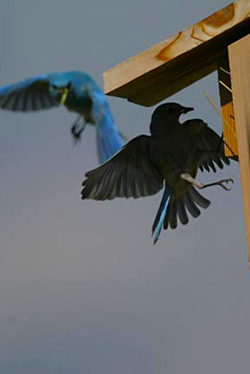
Although close together, it’s tough to concentrate on both birds as the silhouette and light keep them apart.
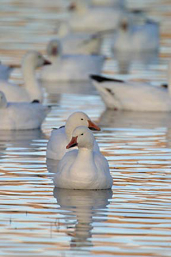
The two snow geese in close proximity and against a bokeh background allow for an easy view of the two birds.
Read Part 2: Shadows, Isolating and Framing the Subject and Pattern and Texture
Read Part 3: Shape and Form, Reflections, and Combining Multiple Elements
by Andy Long
First Light Photo Workshops
All text, screen shots & photos: © 2006 Andy Long. All rights reserved.
Leave a Reply